C.N.G.E.I. –
Between past and future
Our challenge was to restyle the visual identity of the CNGEI association, creating a system for both online and offline communication able to preserve traditional symbols while also moving them towards the future.
Brand identity
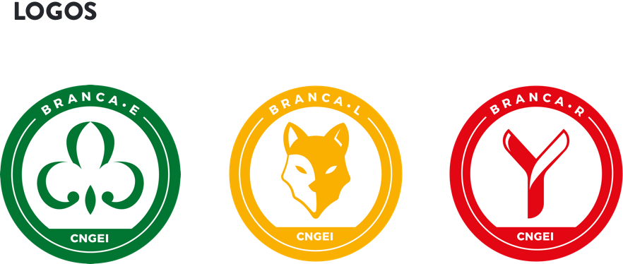
New logos for each section and branch.
CNGEI is an association structured in branches and sectors that need their own logo. We developed a colour palette and designed brand new logos for each section and branch. The circular shape ensures homogeneity and consistency with the main CNGEI logo provided by the Association.
The result is immediate, simple, readable, recognizable and extremely flexible.
Visual identity
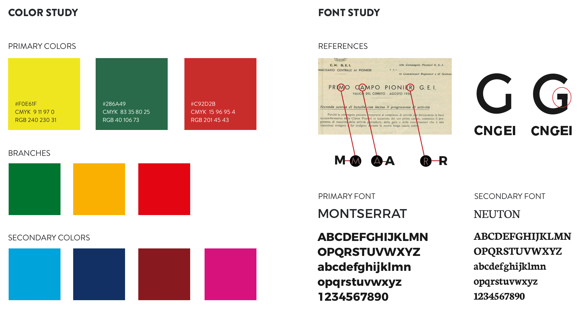
A suitable visual for all levels and structures.
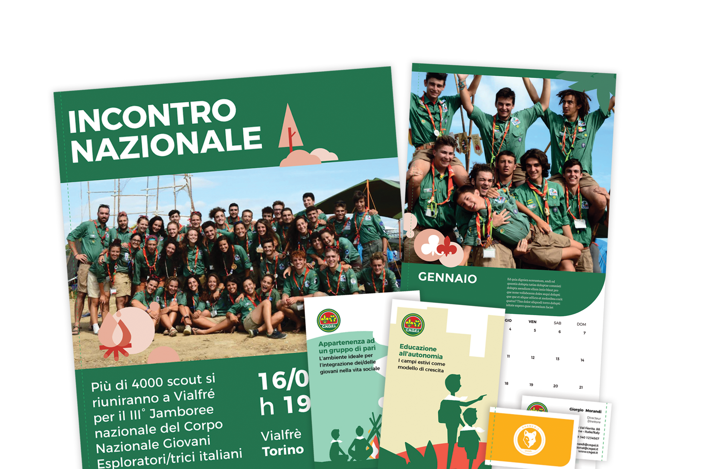
Our main challenge was to provide a precise and consistent visual approach, suitable for all levels and structures within the organization. We also designed patterns to renovate the main templates for both online and offline communication.
Information architecture
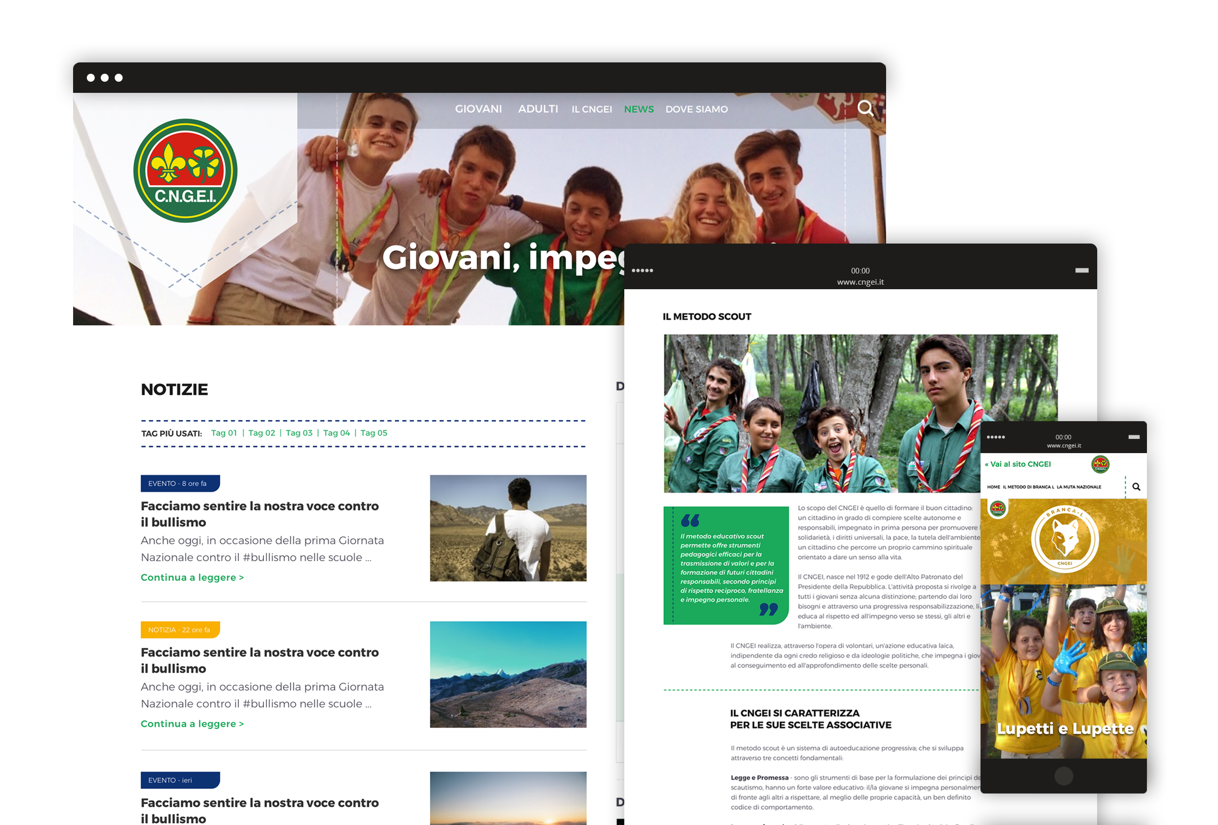
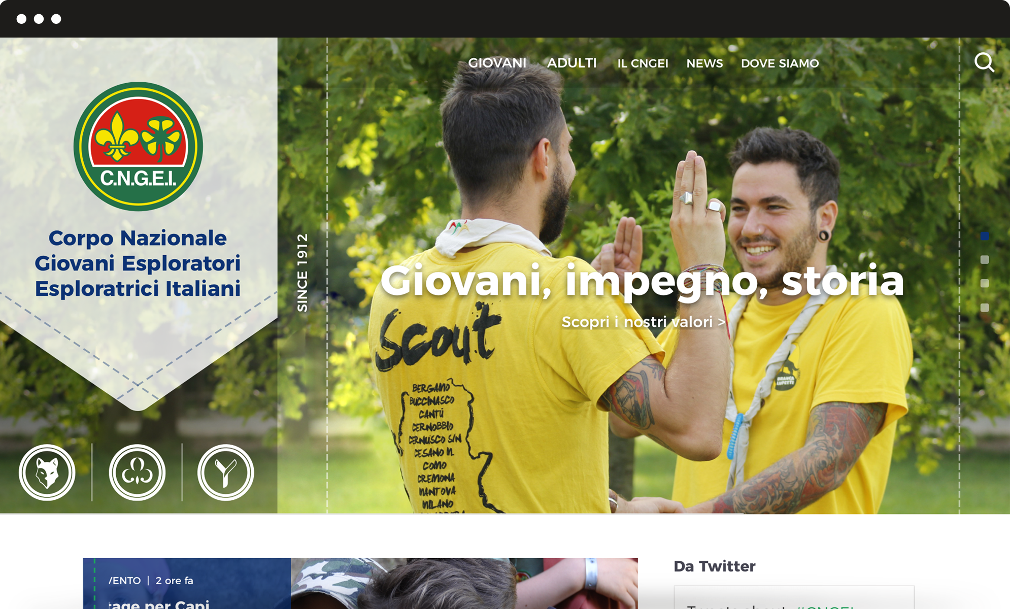
A website that simplifies and optimize the navigation flow.
We completely redesigned the information architecture of CNGEI website to simplify and optimize the navigation flow. The header serves as a launcher to access the three mini-sites related to specific sections, in order to meet the interests and needs of different kinds of users.
