Technology: graphic layout
Agesci –
Redesigning the tradition
Agesci contributes to the education promoting out-of-school activities following the principles of scouts. We built a multi-level information architecture for the website and designed a new visual identity, in order to meet the needs of local groups as well as national departments. We worked with Agesci in creating a new path towards the future.
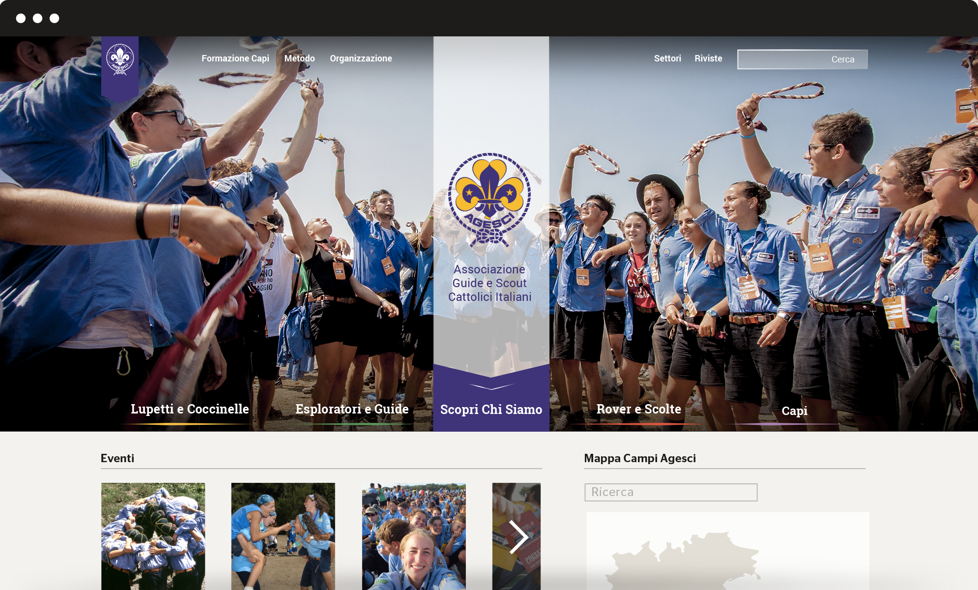
Information architecture
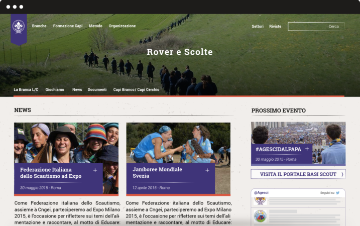
We completely redesigned the information architecture of Agesci website to simplify and optimize the navigation flow. The new vertical structure meets the interests of different kinds of users. The header plays a double role: it provides an overview of Agesci’s world and serves as a launcher to get access to specific sections.
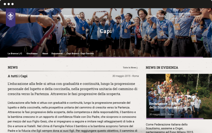
We also created four mini-sites for every branch: Lupetti and Coccinelle (8 to 12 years old), Esploratori and Guide (12 to 16 years old), Rover and Scolte (16 to 21 years old), Capi (older than 21 years old). Each has its own colour.
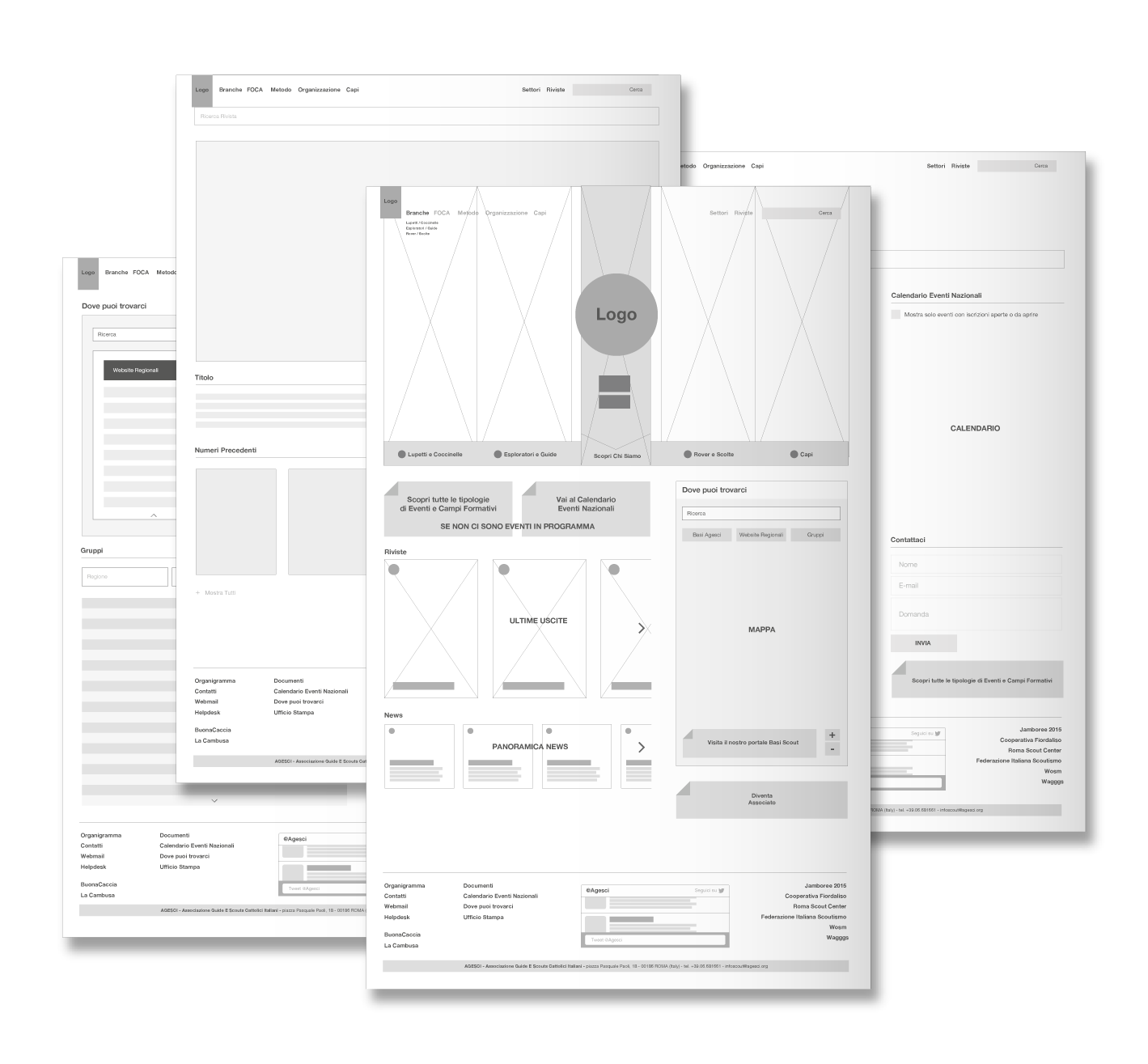
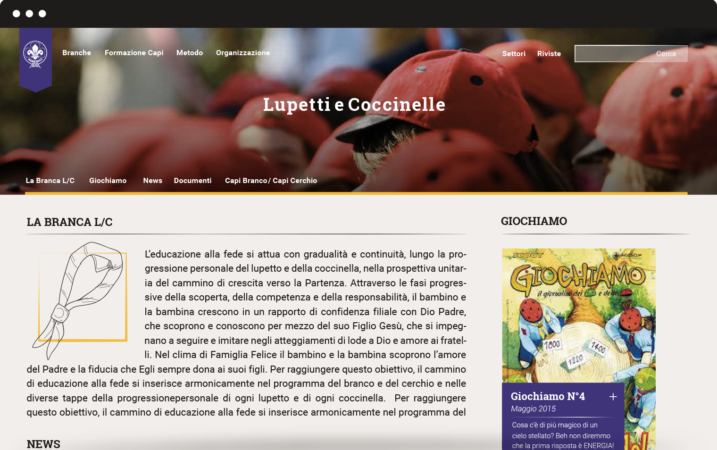
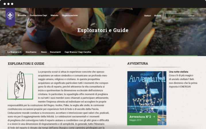
Graphic layout
We succeeded in finding graphic solutions that hold together tradition and innovation. Gold and violet are the traditional colours of Agesci logo: we chose three different shades of violet and combined them with three complementary colours, to let the violet emerge as the prominent colour. To guarantee high readability we chose Roboto and its serif version Roboto Slab as font: this choice also reflects special care for tradition because it’s very similar to some fonts used for scouting manuals at the beginning of the century.
Visual identity
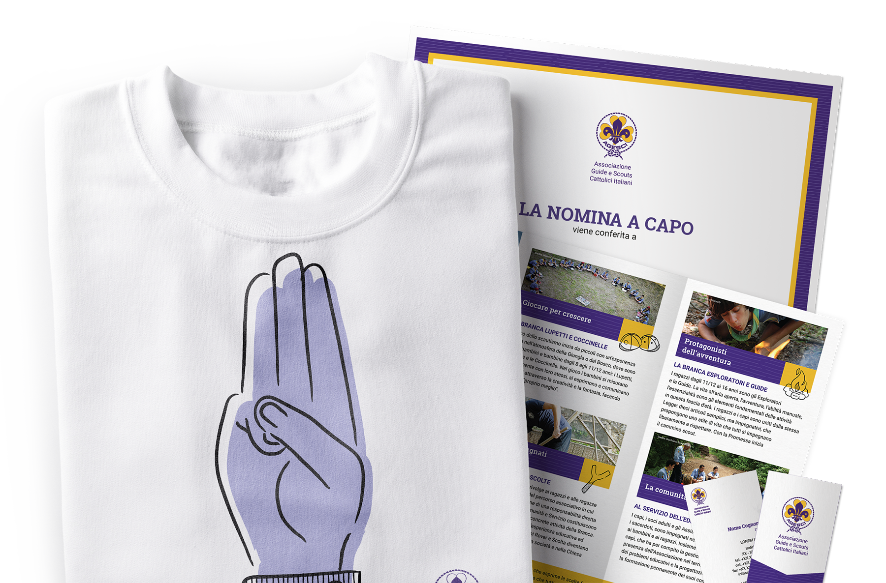
We worked on restyling the logo for regions, zones and groups and we designed a mono-colour logo mark to be used in informal contexts. We also designed patterns to renovate the main communication templates.
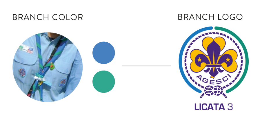
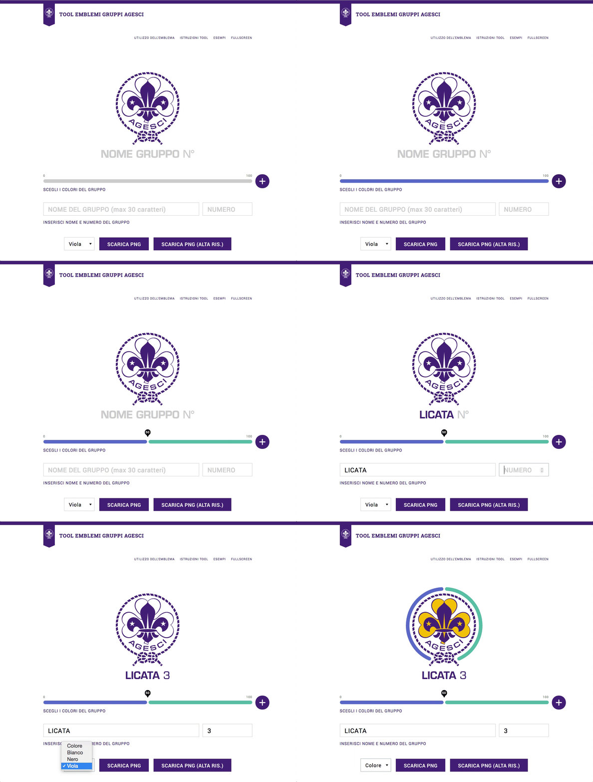
We designed an online tool to customize the logo based on the colours of each group’s iconical handkerchief. The tool allows creating a coloured circle that surrounds the official national logo, becoming the hallmark of the group. This is a user-centred solution that strengthens the coherence of Agesci visual identity while enhancing specific local dimensions.
FAI Fondo Ambiente Italiano –
A world of support for the Italian heritage.
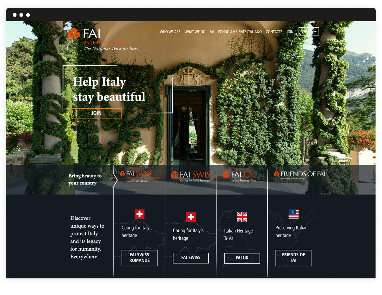
We were asked to create a website that could communicate the mission of the foundation and share contents from the different national groups of volunteers. Working on both the back-end and the front-end, we designed an optimized information architecture, available in several languages, which smoothly guides users through FAI International activities and opportunities.
Vertical structure
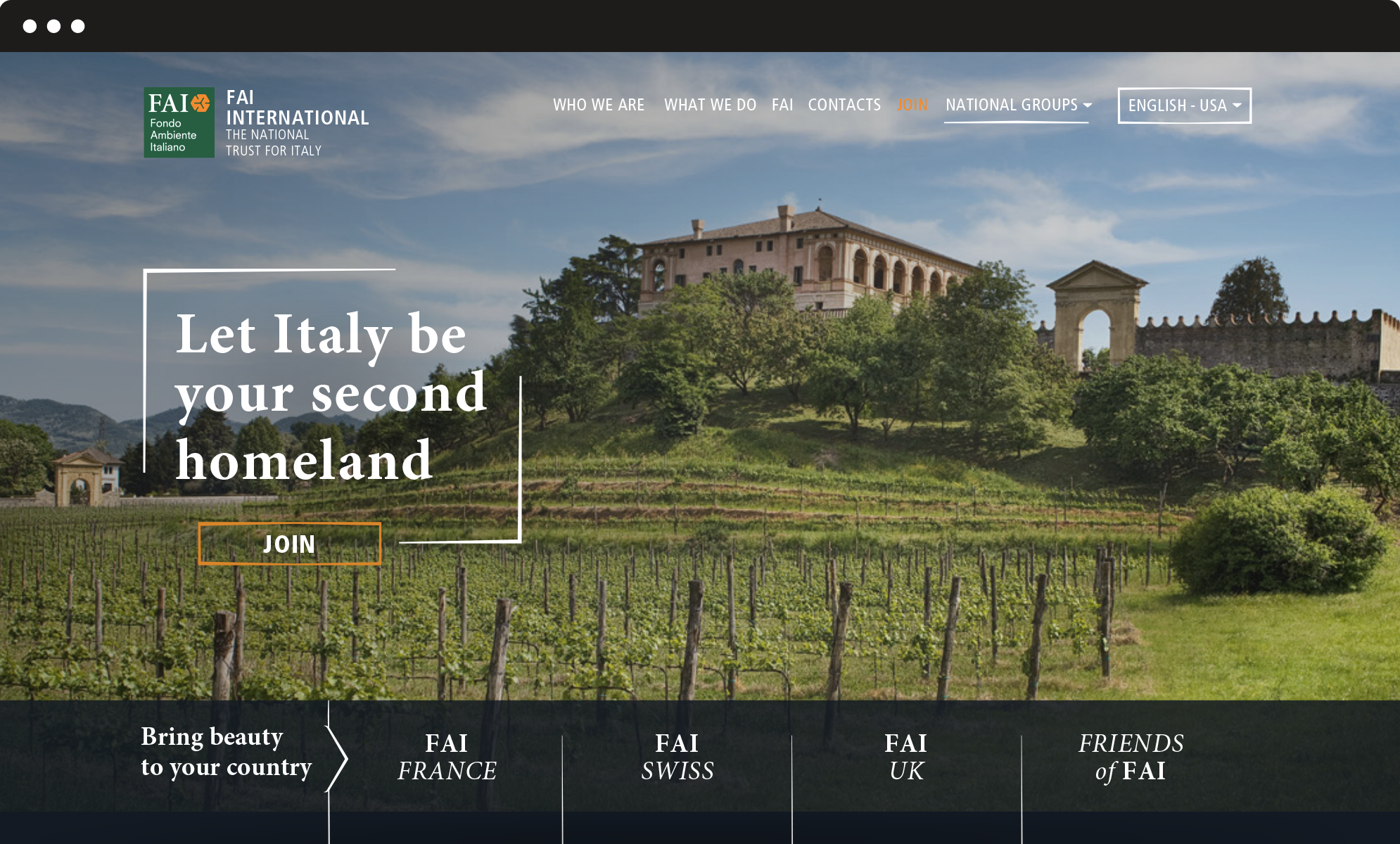
From the main landing page, designed to welcome the visitor, users are invited to explore the vertical layers which correspond to the national websites, as well as the different calls to action, such as become a member, donate, join us. The vertical structure ensures clear and simple navigation and progressively involves the user in the vast and diverse world of FAI.
Graphic layout
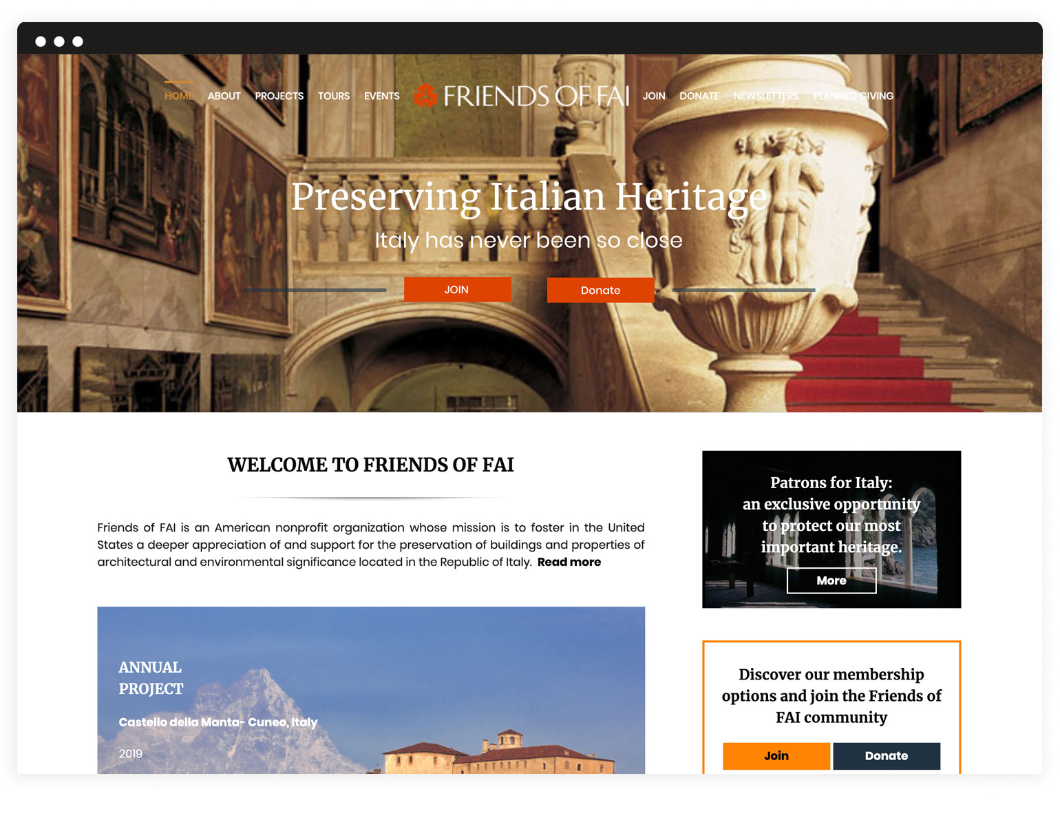
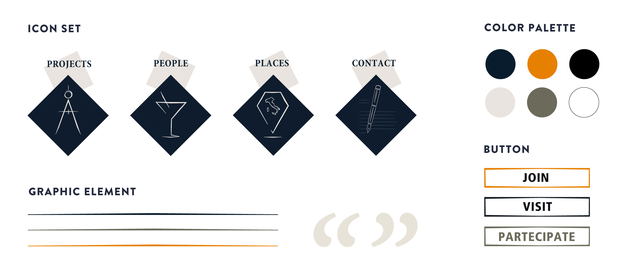
With its elegant and evocative aesthetics, the graphic layout enhances the easy navigation and emphasizes the official and coherent image of the foundation. It answers the need for a unique and solid image of FAI, apt to be shared through its different national groups.
Multisites
In order to facilitate the use of the websites by FAI volunteers worldwide, who do not have professional technical skills, we chose WordPress as CMS. Besides a common set of functions, we selected a range of sections that can be activated according to specific national group’s requests. A multisite network which ensures integrated and centralized management and maximum graphical coherence.
Woocommerce plugin
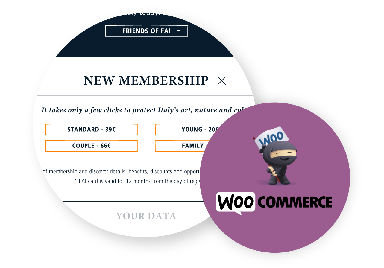
We implemented the subscription and the donation forms with customizable options available for each specific national site. We chose Woocommerce to manage and optimize the membership and donation process, so that every step is handled through the website: both the user and the admin do not have to involve other systems and all the processed data are already in one place.