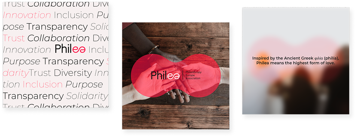
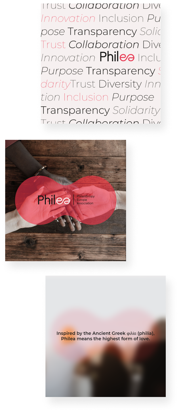
PHILEA –
Branding and identity for Philea
Philea is a European association, born from the union of two previous organizations called EFC and Dafne, which nurtures a diverse and inclusive ecosystem of foundations, philanthropic organizations and networks working for the common good. Our challenge was to create a brand new naming, logo, and visual identity able to express the mission and the vision of the new association.

Naming and logo
The naming Philea originates from Philia, which in ancient Greek means “the highest form of love” and is one of the meanings used in the word “Philanthropy”.
Playing with the phonetics, we replaced the letter “i” with the letter “e” in order to create an acronym for Philanthropy Europe Association.
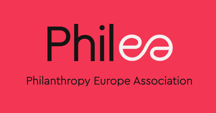

The logo focuses on the idea of union and connection. The last two letters “e” and “a” are connected by using a unique line and a different color. The shape that comes to life from this union recalls the infinity symbol.
The idea of connection and union refers to the convergence of EFC and Dafne, but generally speaking it refers to the many different services united in one association at European level. The result is an elegant logo with a warm, modern and vibrant tone of voice.
Visual Identity
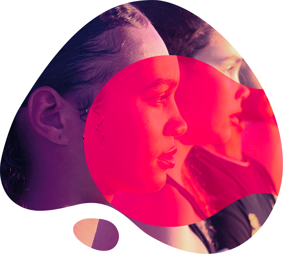
Philea’s visual identity is modern, fresh but emotional at the same time. Colors are bright and give character to the brand. Images have a fundamental role: they convey the intentions and bring emotion and warmth and represent people at the center of the storytelling.


A new website
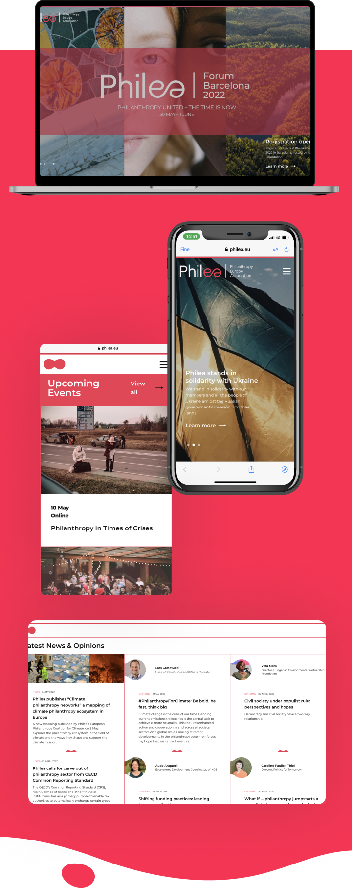
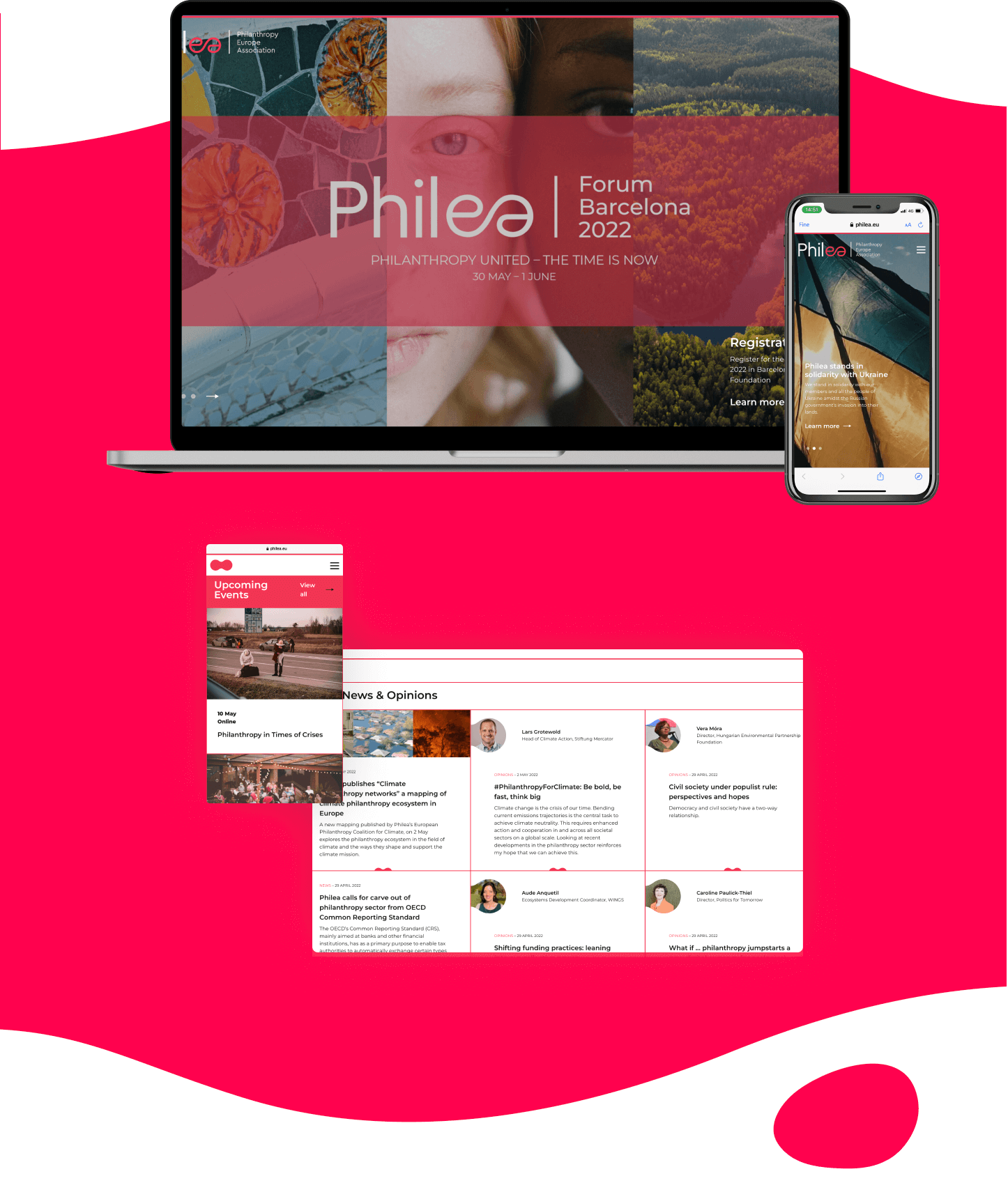
We created the new website based on the new visual identity. We co-designed, together with Philea’s team, the sitemap and information architecture, as it required merging most of the content from 3 existing websites. This was by far the biggest challenge, as it needed to accomodate a lot of different content, be scalable, and at the same time be intuitive for the users.
Launch Campaign
The new brand and website were launched online with a dedicated communication campaign which included: mailing, social media posts, and a challenge on Twitter. The concept of the campaign was focused on the idea of union and friendship in order to talk about philanthropy and association main values.
