EDITORI LATERZA –
New Laterza’s website: a space for imagination
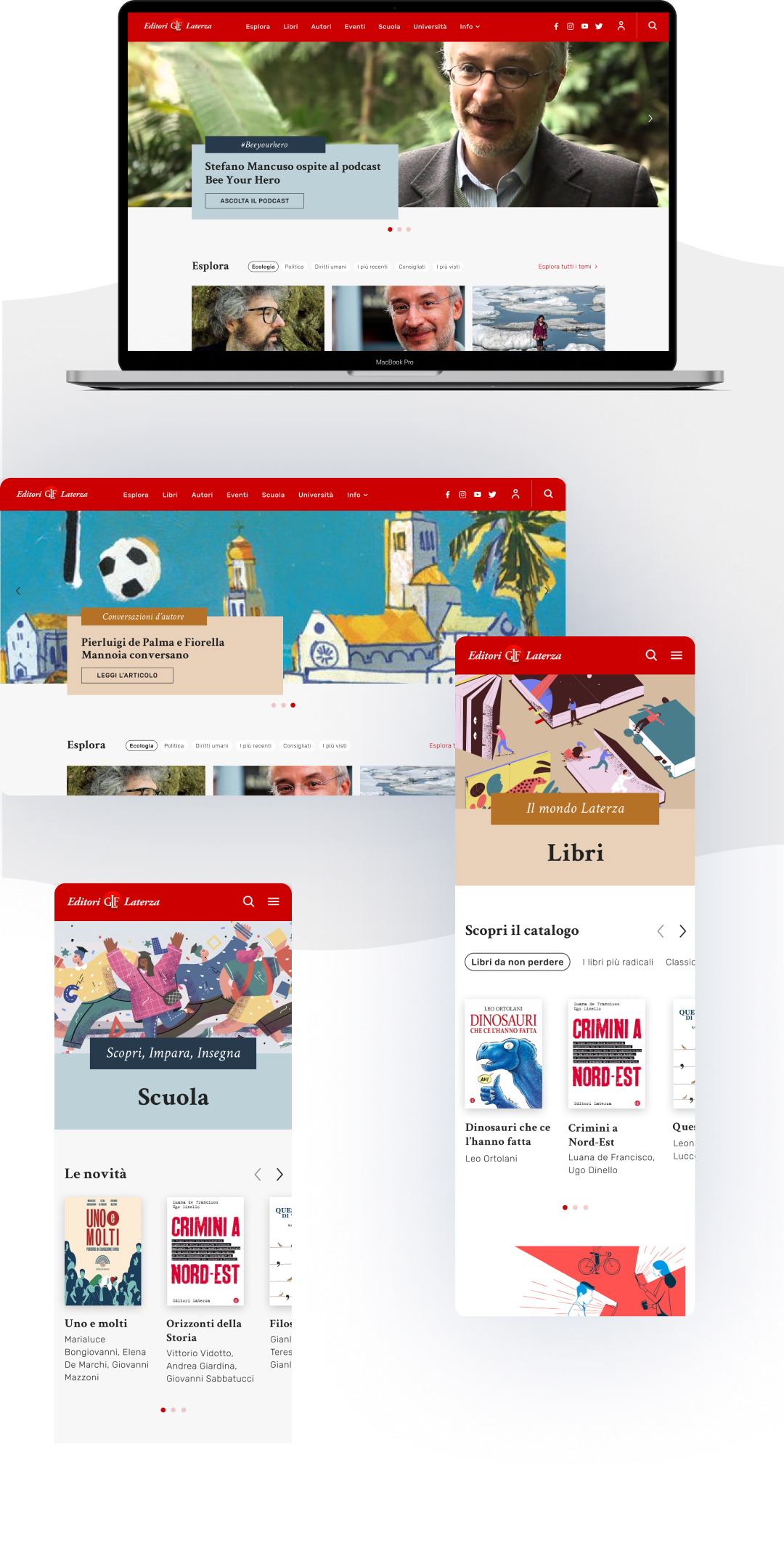
To design the new Laterza website, we started from the complex and fascinating need of creating a cultural revolution around books and their authors through a multimedia, modular and flexible digital space. We ended up creating a website rich in content that enhances the catalog of the historic publishing house from Bari.

UX-UI design
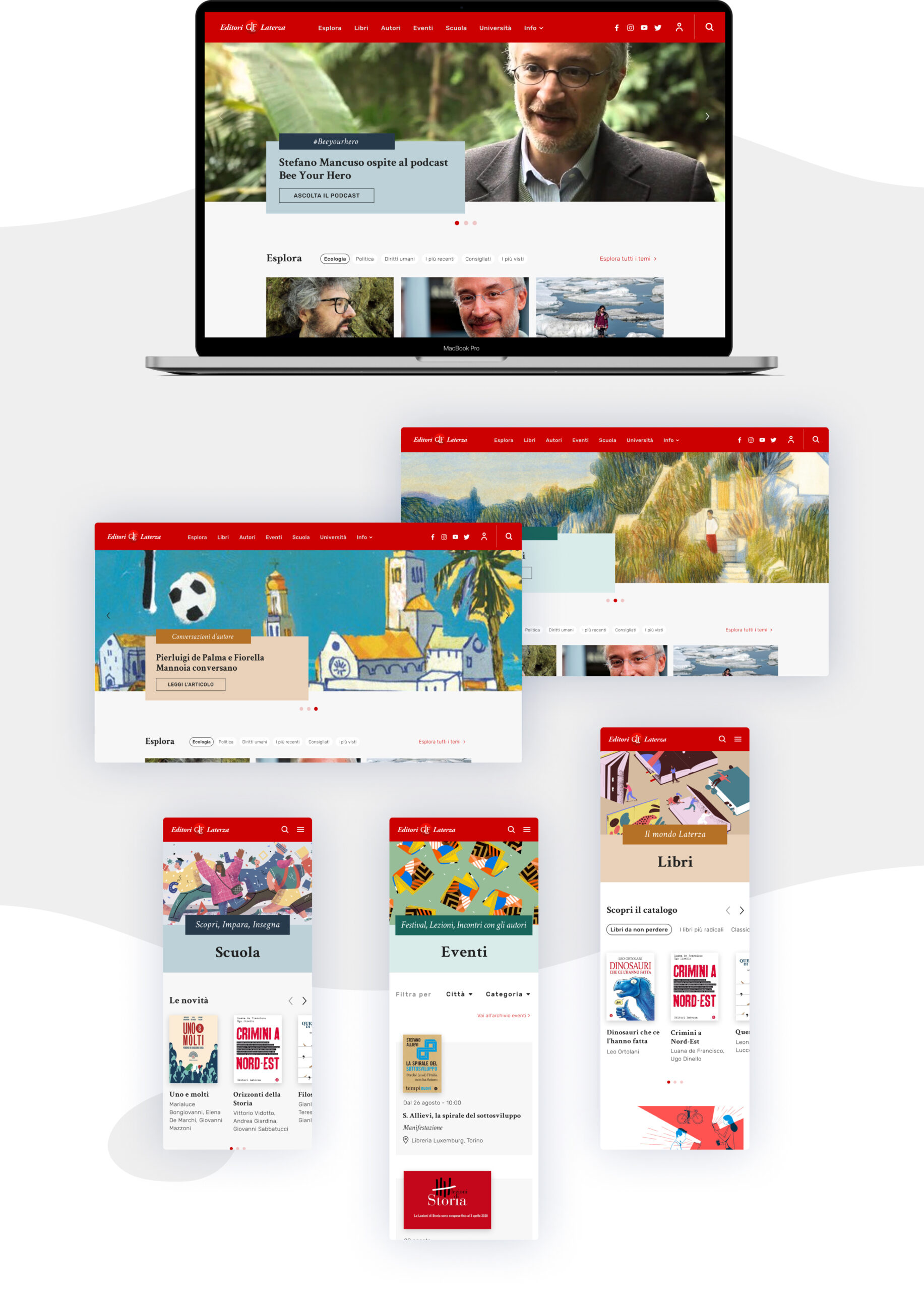
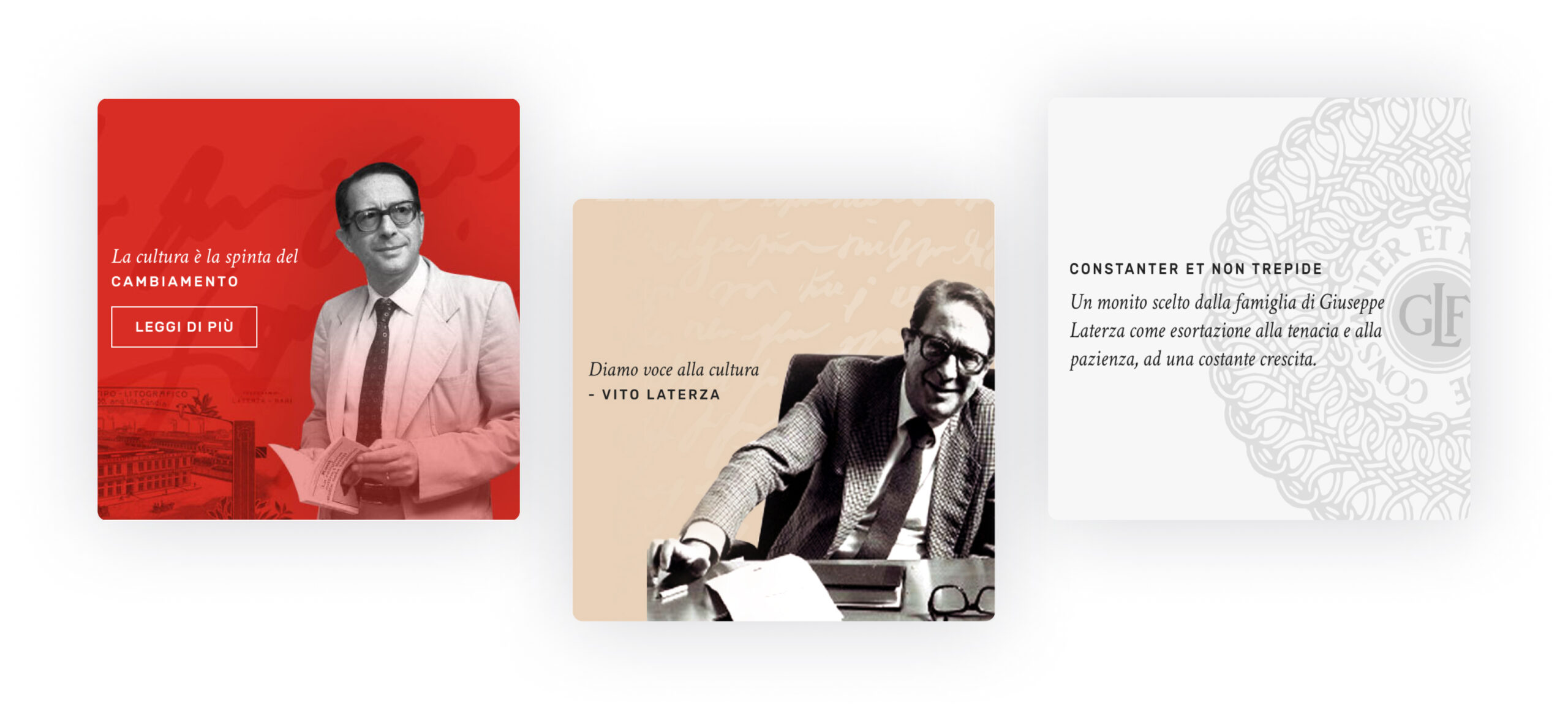
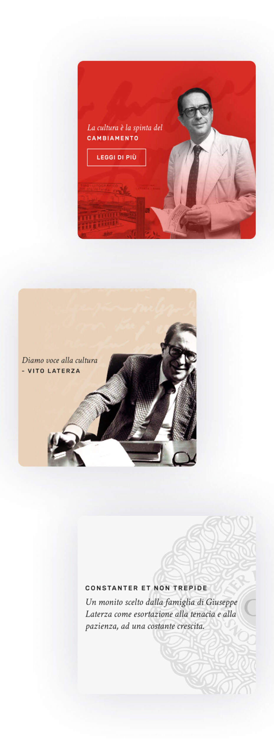
Together with Bomberos Design we made the user experience simpler and more intuitive, allowing users to customize certain sections according to their individual preferences. We have designed new headers and more colorful and impacting sections featuring texts, quotes, historical photos.
Brand design
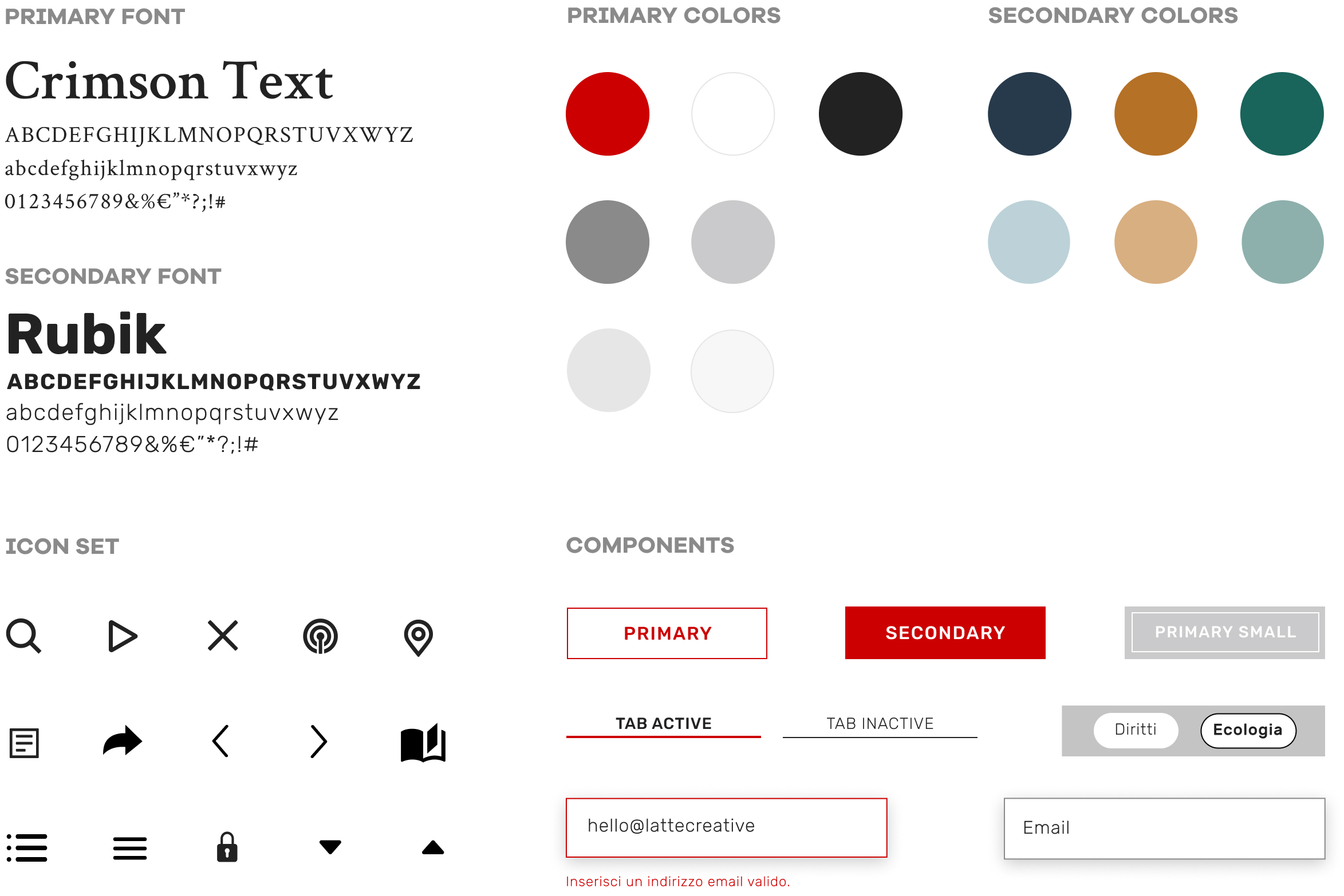
The typography focuses on new typefaces: a modern and linear one for the titles and a softer and more readable one for small texts. In the color palette the classical Laterza’s red is accompanied by three colors that give rhythm and consistency to the whole website.

Web development
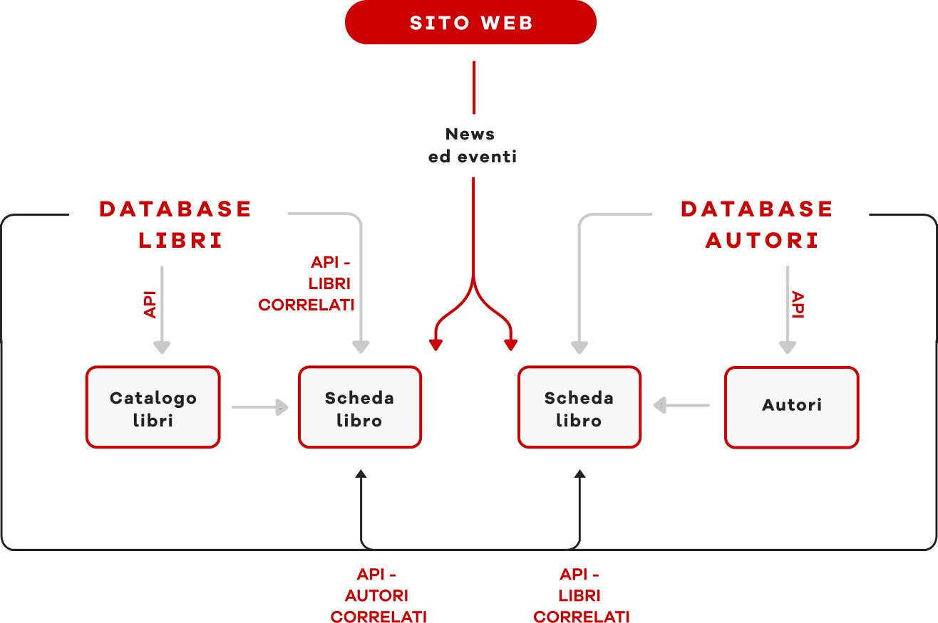
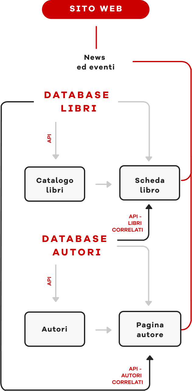
This was achieved through careful frontend development and supported with the integration of a CMS for the management of news and events.
The pages of the books and the catalog were created using the API provided by Graphiservice.
