MO’ Progressi –
I come to look for you!
Mo’ is not just an event, but a movement of young aggregators of change. Mo’ looks for young people who act with deeds and not only with words. They are young people who feel the urge to mobilize, to commit themselves and who want to be personally the change they want to see in the world.
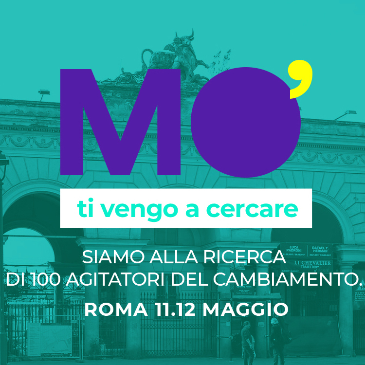
Brand identity
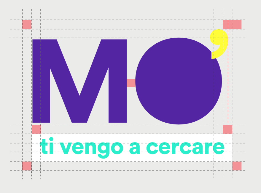
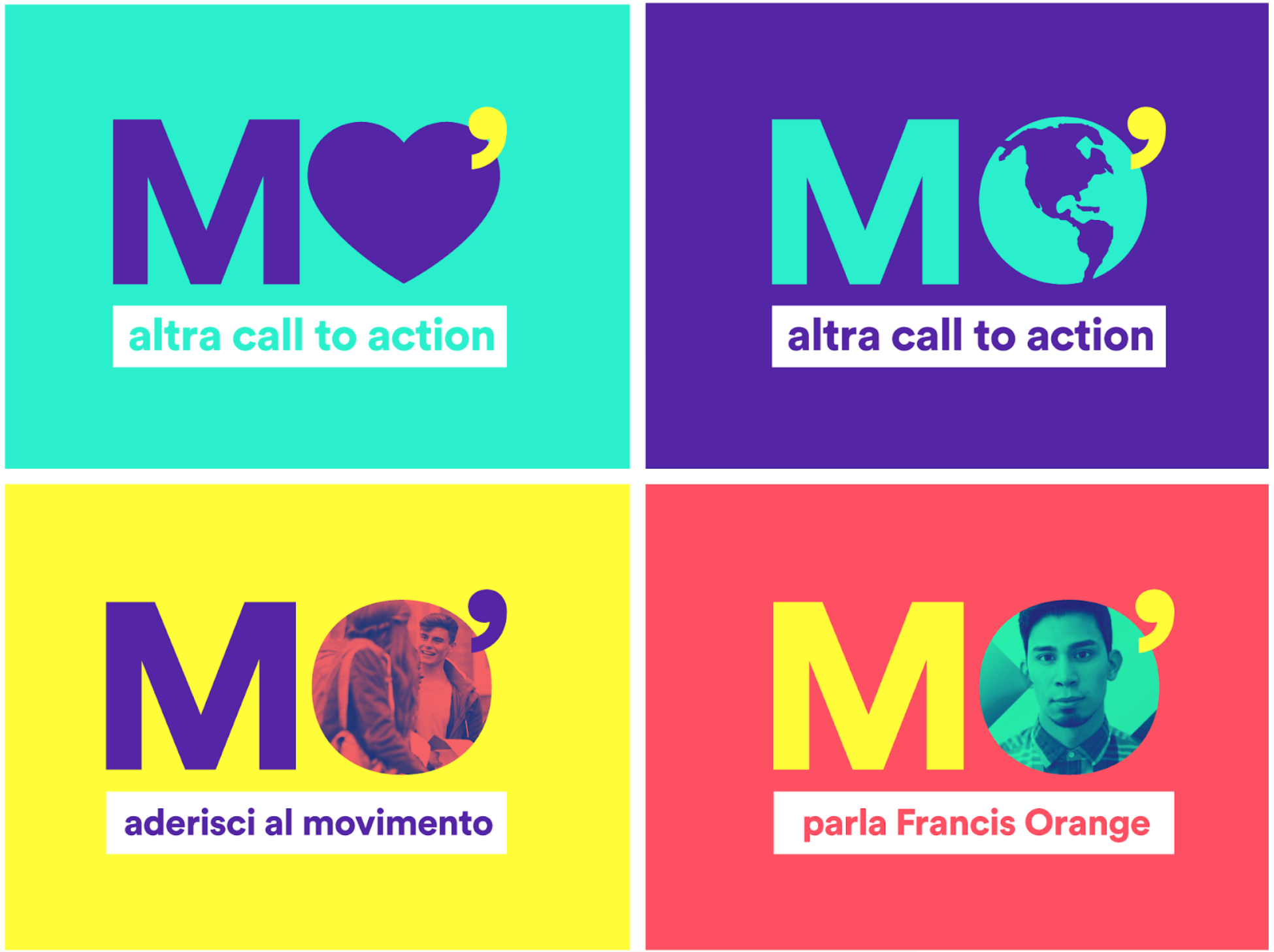
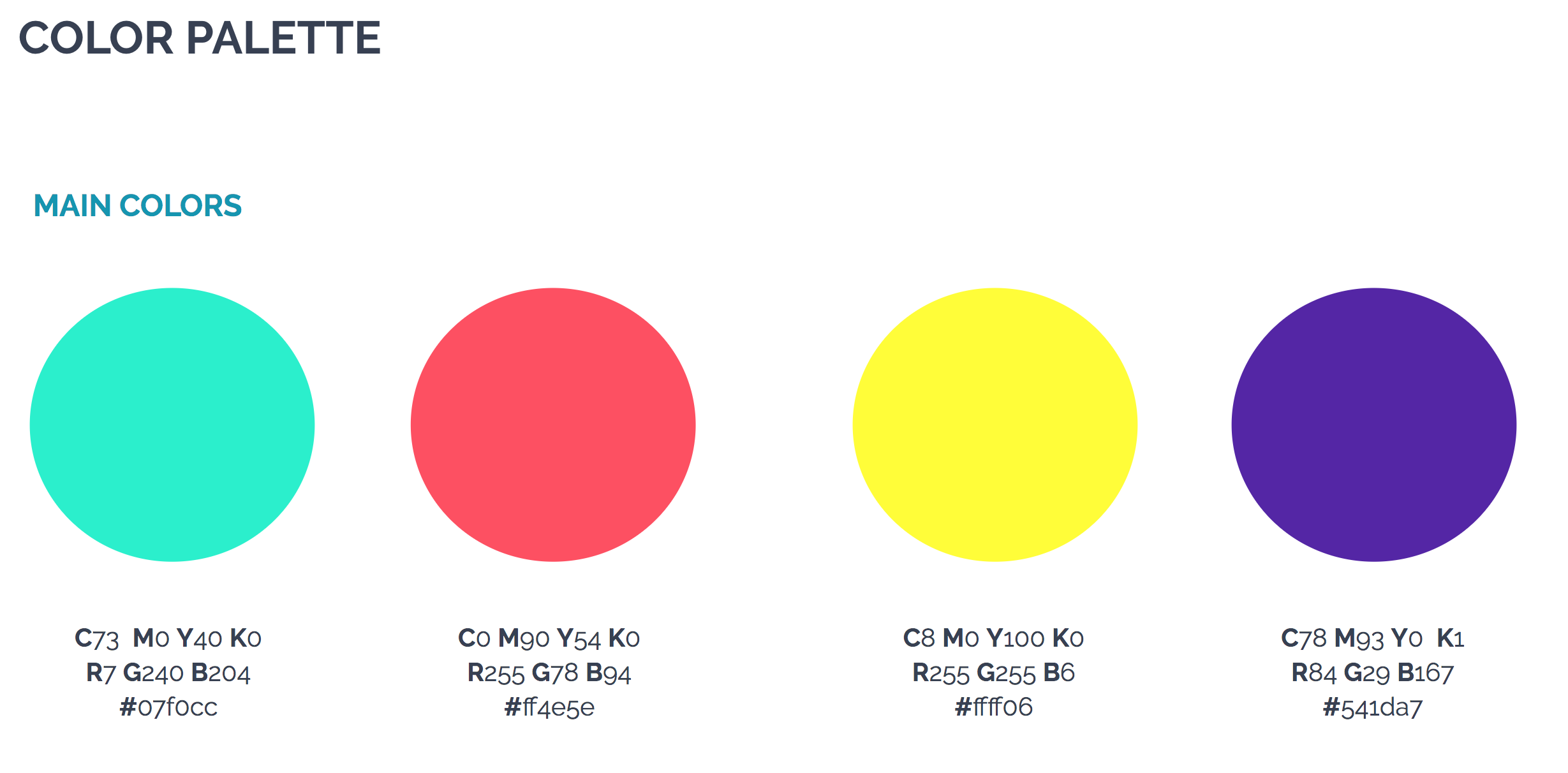
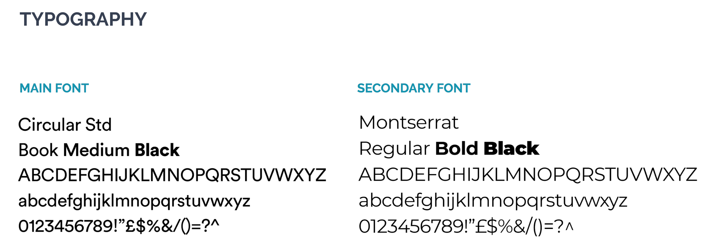
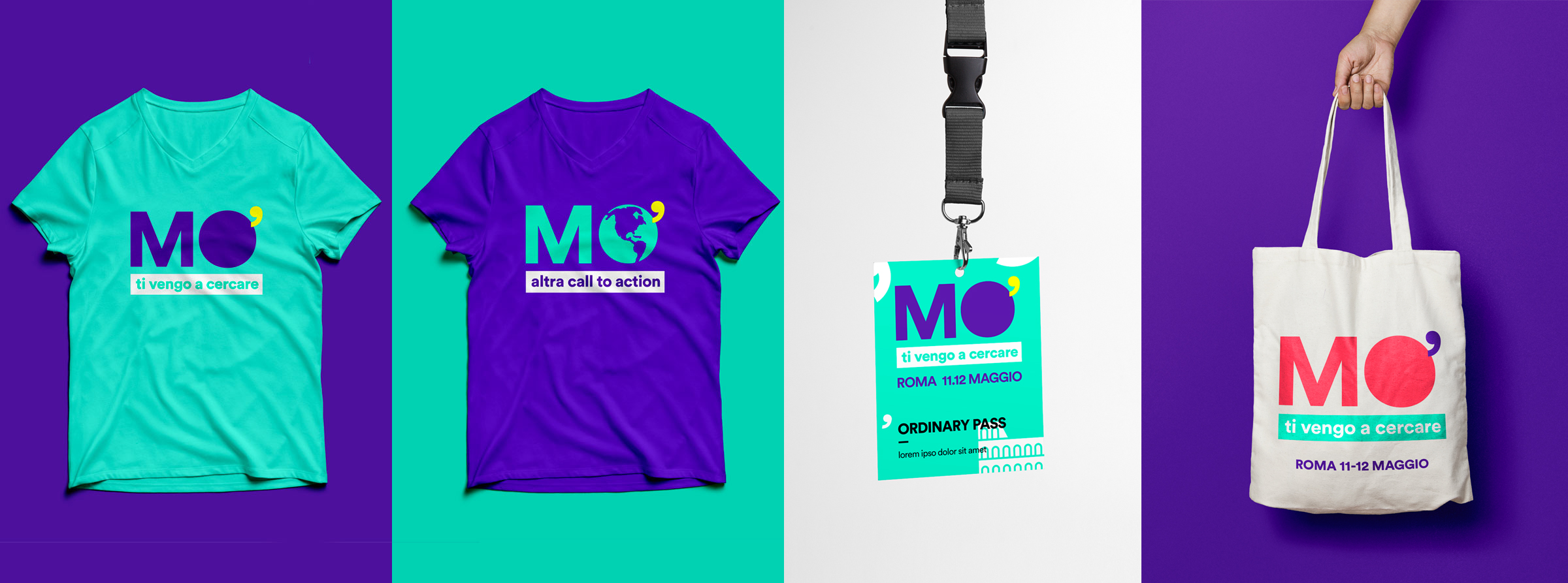
With very marked typography and the combination of pop colours, the invitation to movement is emphasized. A logo that also becomes visual. The structure is suitable for evolution in a dynamic brand: an extremely flexible visual for each content and theme of the event.

Website
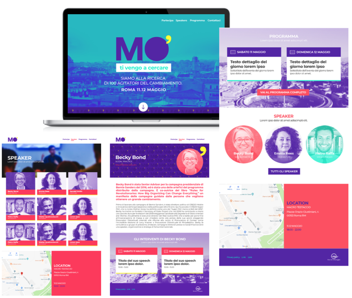
Mo’ website is visually consistent with the brand identity developed.
The homepage focuses on the mission of the project and the dates of the event. It is possible to consult the program, find specific information about the event and the speakers and follow the social stream.
Social campaign
We have created a social campaign to create awareness, accompany the event and always involve a greater number of users. With an ironic and pop language, we have created animated cards, videos and gifs with different objectives.
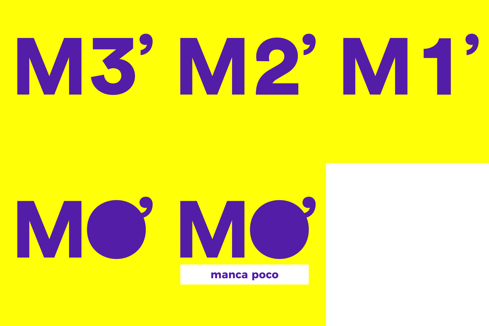
Teaser and countdown
With the aim of intriguing users about the event, we have created card teasers and countdowns.
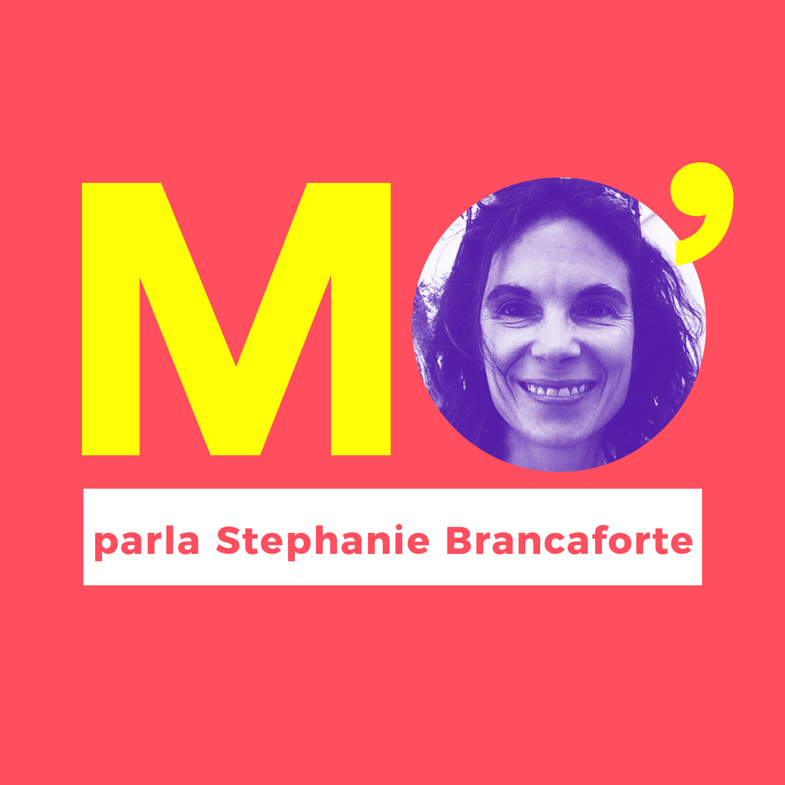
Speakers and speeches
The function of these cards was to inform users about the day’s program and about the profile of the speakers who gave the speeches.
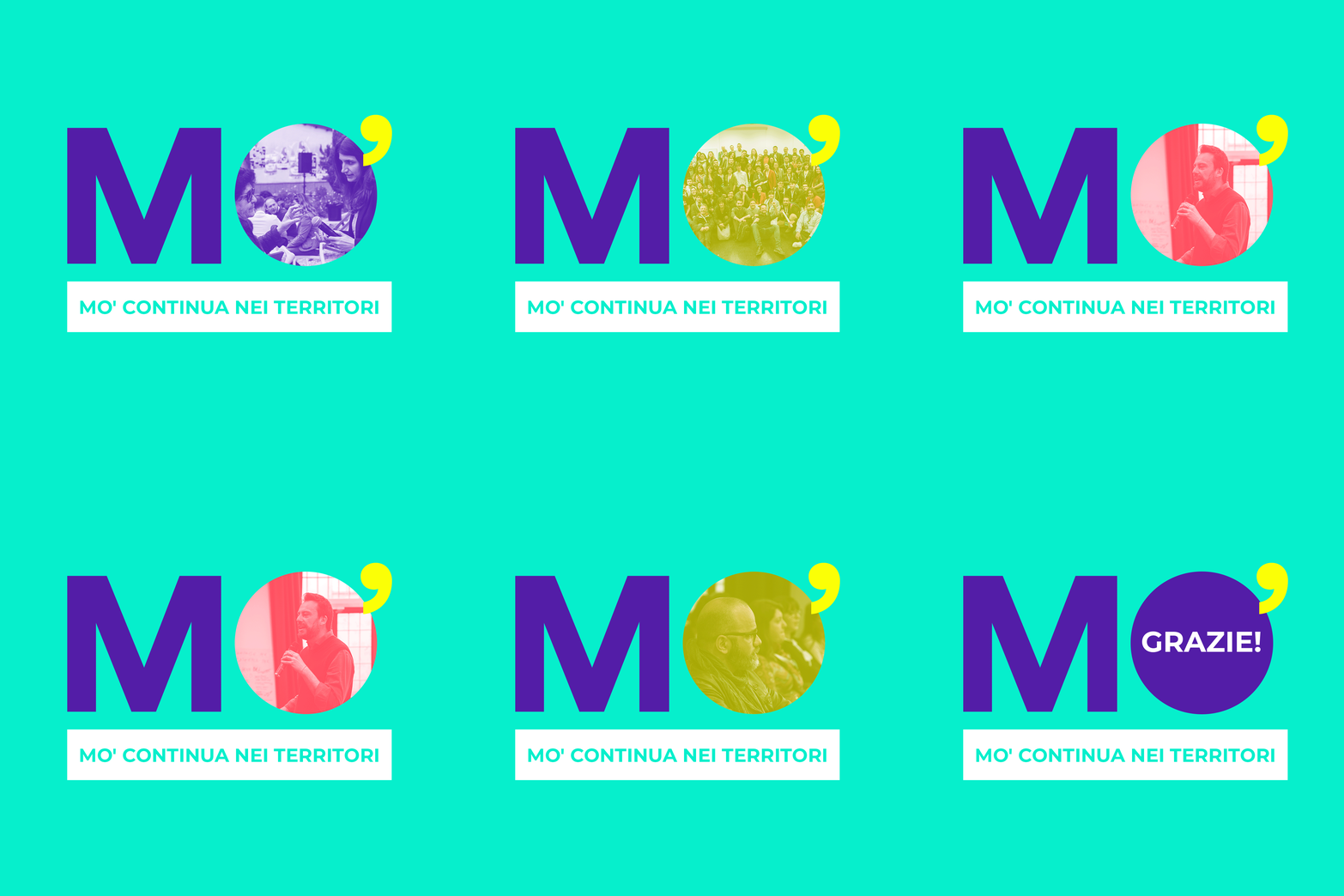
Follow up
Finally, we created cards to invite users to follow Mo’ even after the end of the event.