Topic: social media
Doctors Without Borders –
Search and rescue: saving lives at sea
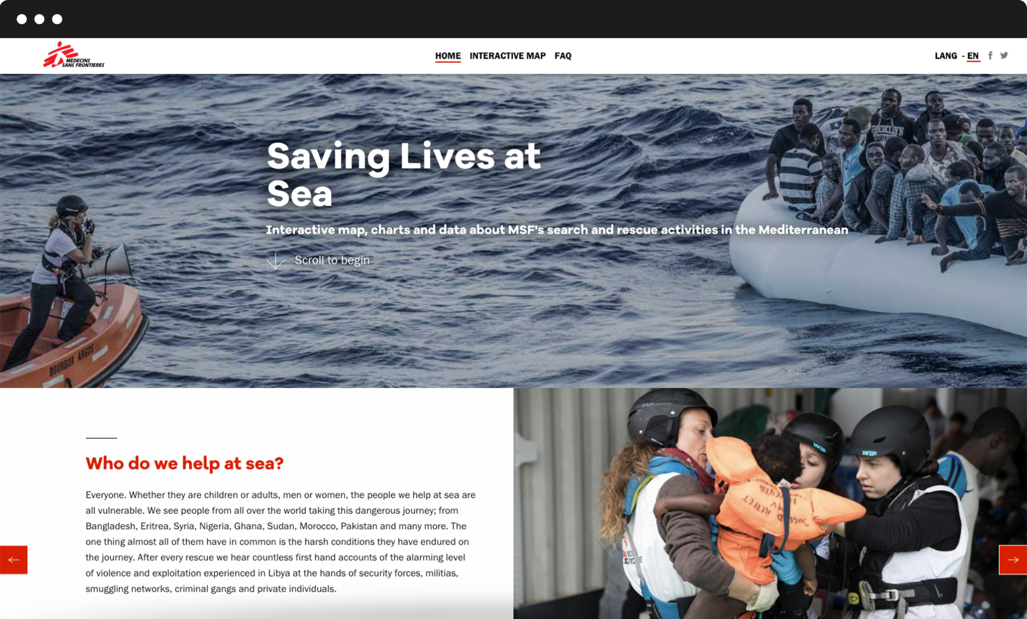
A website with all the information about Search and Rescue activities to show how huge and important is the work done by MSF in the Mediterranean, with an interactive map and detailed graphs.
Data visualization
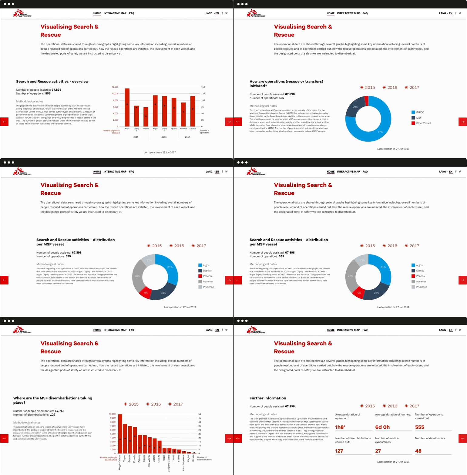
Images work better than words when explaining complex facts.
Data and visual reports allow the user to easily interpret MSF activities: everyone can quickly grasp the most significant information on MSF rescue operations in the Mediterranean from 2015 until today thanks to mouseover functions and filters to select specific years of activity.
Interaction
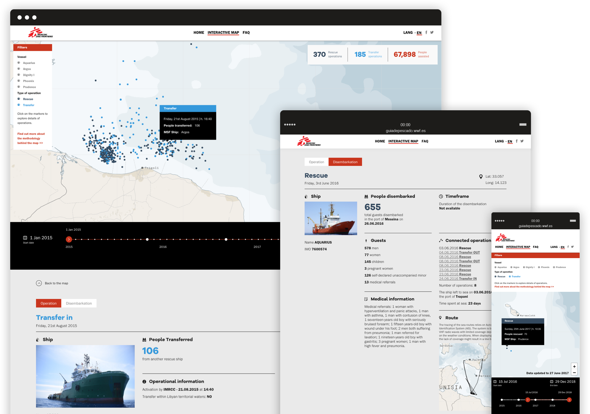
An interactive map that allows the user to explore a lot of information in an engaging and easy way.
Together with Code for Africa we implemented the interactive map, a tool that allows the user to explore a lot of information in an engaging and easy way.
Filters can be used to select specific vessels and different types of the operation, while ships are displayed by dots that, when clicked, open a data sheet with detailed information such as the number of people rescued and the duration of every operation.
Flexibility
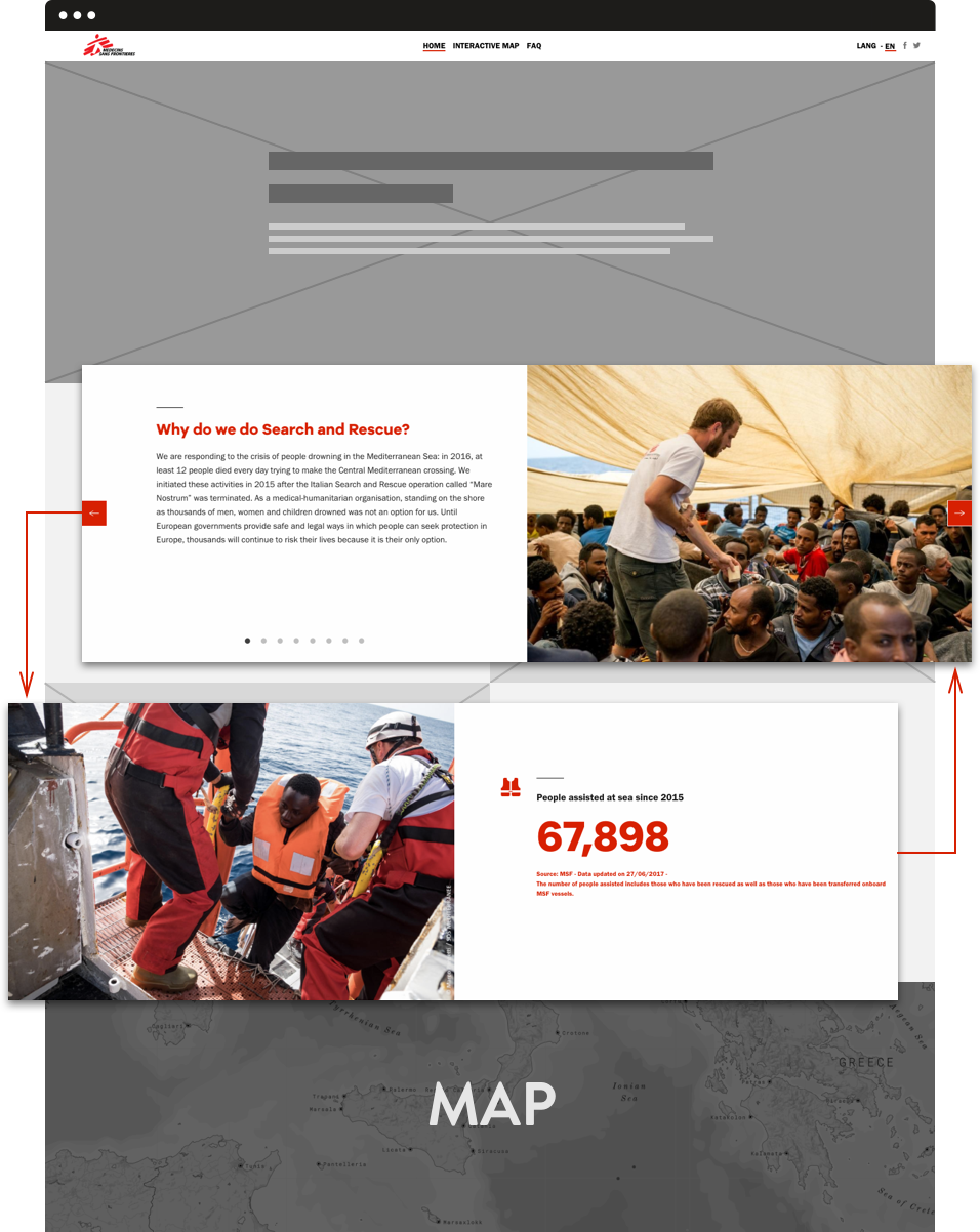
A modular structure that doesn’t interfere with the stability of the site.
The entire website has been designed and developed in a very short time, while different contents were being constantly produced, updated and translated even after the launch. The need for it to be as much flexible and yet stable as possible was crucial, so we built a structure based on modules that can be filled and assembled in different ways without affecting the site’s overall stability and always ensuring smooth navigation throughout the pages.
Compagnia di San Paolo Foundation –
Riconnessioni: a school for the future
Riconnessioni is a project that wants to bring systemic change to primary and lower secondary schools.
All the pieces perfectly fit together: new brand identity for the project, an elaborate website for multiple audiences (teachers, parents, stakeholders, and the general public), an animated promotional video and a communication plan supported by print and digital assets.
Brand identity
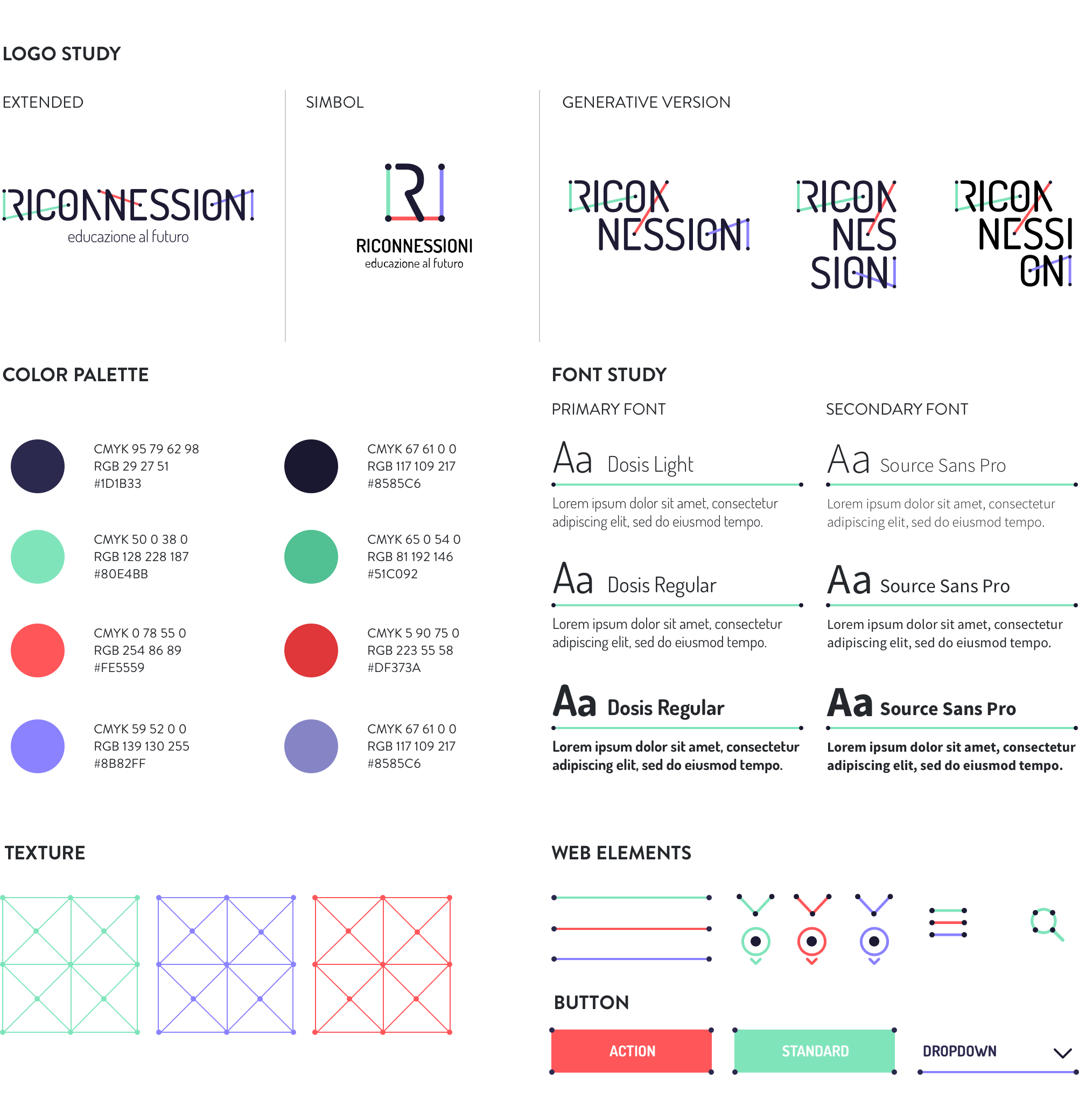
An impactful and communicative logo able to show the three faces of the project: digital, education, community.
We worked on the typography to emphasize the concepts of connection and collaboration, which are recalled by the network of coloured segments connecting the dots within the title. The graphic treatment allows for several declinations of the logotype itself and graphic paths (icons, texture), while the ratio behind the segments ensures homogeneity and consistency. The result is immediate, simple, readable, recognizable and extremely flexible.
Website
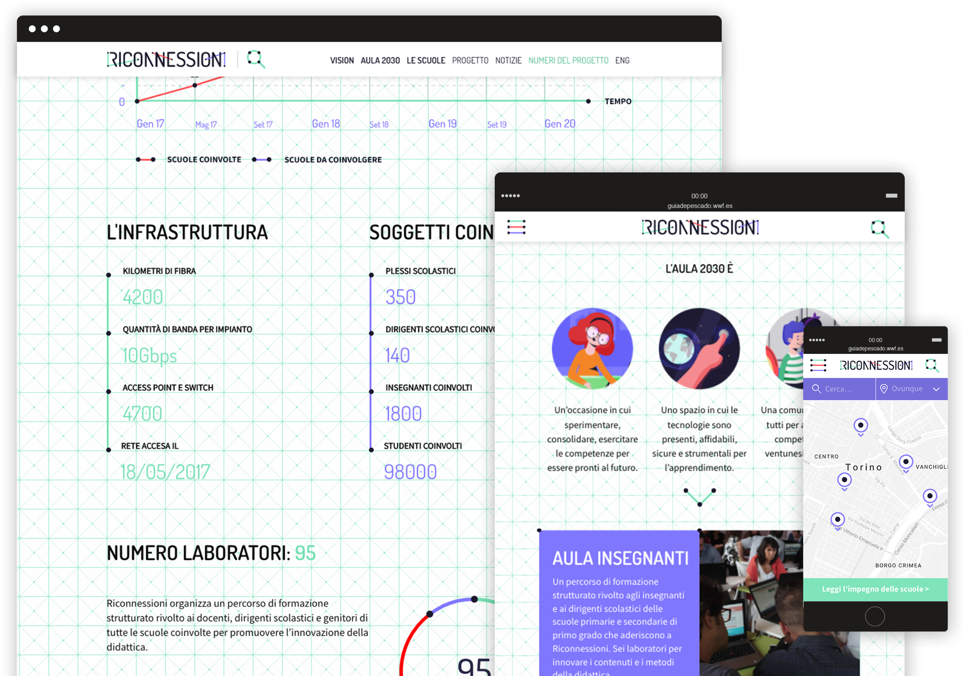
A website for many audiences.
Riconnessioni is made by and for teachers, headmasters, parents, kids, institutional stakeholders, and a number of professionals from different areas of expertise. All these segments need to easily find the right contents on the website, navigate through the pages, interact with articles and be able to retrieve useful information in a few clicks.
Animated video
The story of Viola looking for her future.
We produced a 2D animated video addressed to all the target audiences involved in the project. The smooth and emotional characters animation helps to explain complex technical and pedagogical issues, by telling the story of Viola, a little girl who is looking forward to discovering her exciting professional future!
Engaging the community
From smiling to discussing, from liking to resharing.
After a careful analysis of the different target segments we wanted to reach through social media, we created an animated video and 3 series of cards in which catchy graphics and fun copywriting engage the audience on different levels.
A fresh way to explain the project and invite people to become part of the community!