Topic: HUMAN RIGHTS
CEJI –
Together against the hate speech monster
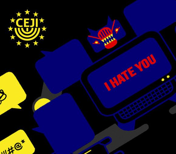
CEJI asked us to create a video to launch an online training program within the Facing Facts Project about the hate speech theme. The main target are students, institutions, organizations trainees, but also generalist public. We used an informative and engaging tone. We described hate speech as an aggressive, transformer/like a monster.
Character animation
We designing characters without falling into stereotype.
We put a lot of effort into designing characters that respect ethnic, religious, gender and orientation diversity without falling into stereotype. Instead of character neutrality, we opted for plurality for what include the script, the voice over and the arts: we represented a large number of categories to show that everyone can be hate speech targets.
Multiple targets
A public with an awareness of the subject, but also a more generalist audience, needing more information.
Hence the need to inform and raise awareness of the overall framework and at the same time the use of an ironic, metaphorical tone of voice to attract and engage viewers that are not used to this kind of content or do not know the subject. The final call to action invites everyone to join the Facing Facts community and start the fight against hate speech.

L’albero della vita –
A social experiment in defence of indigent mothers
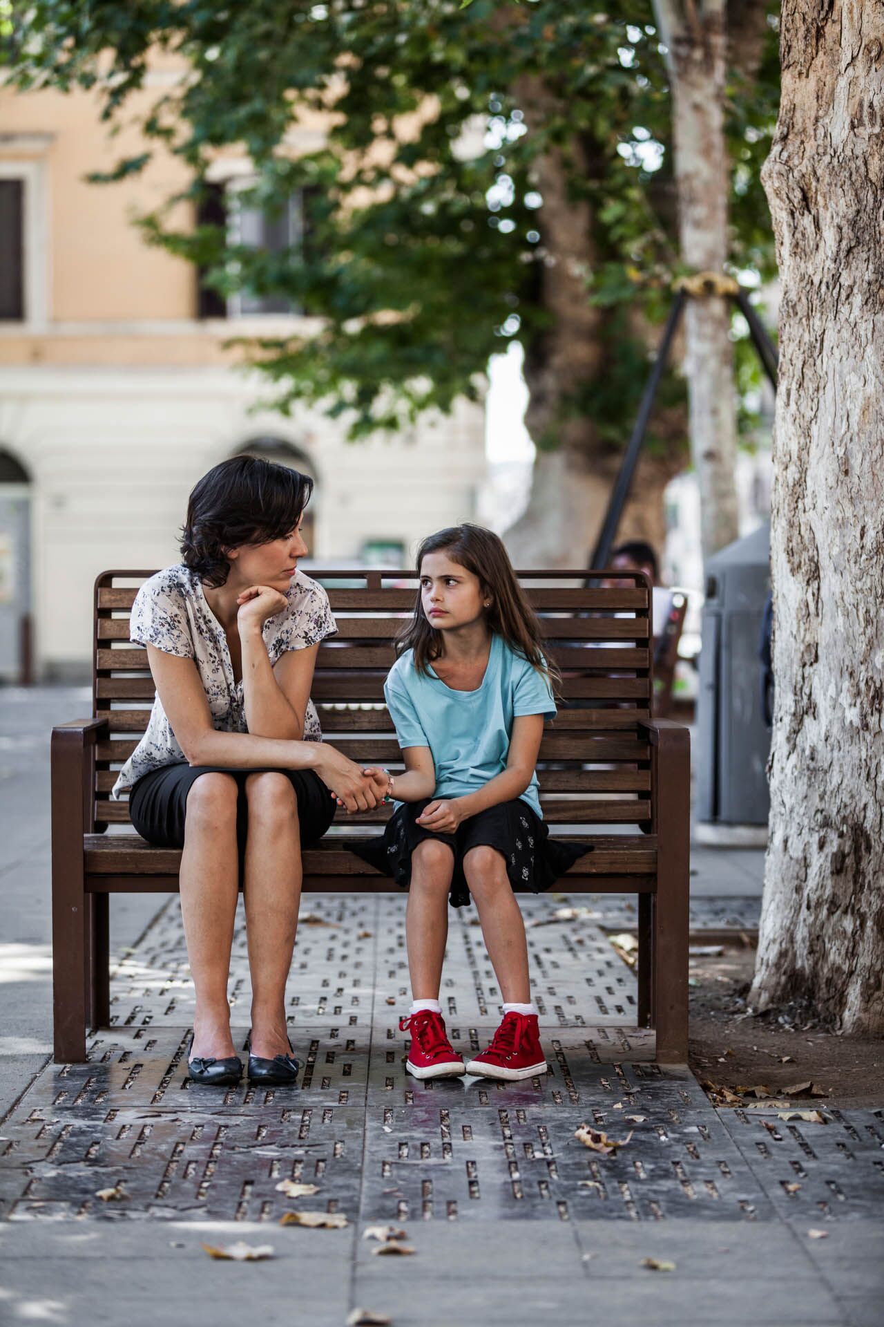
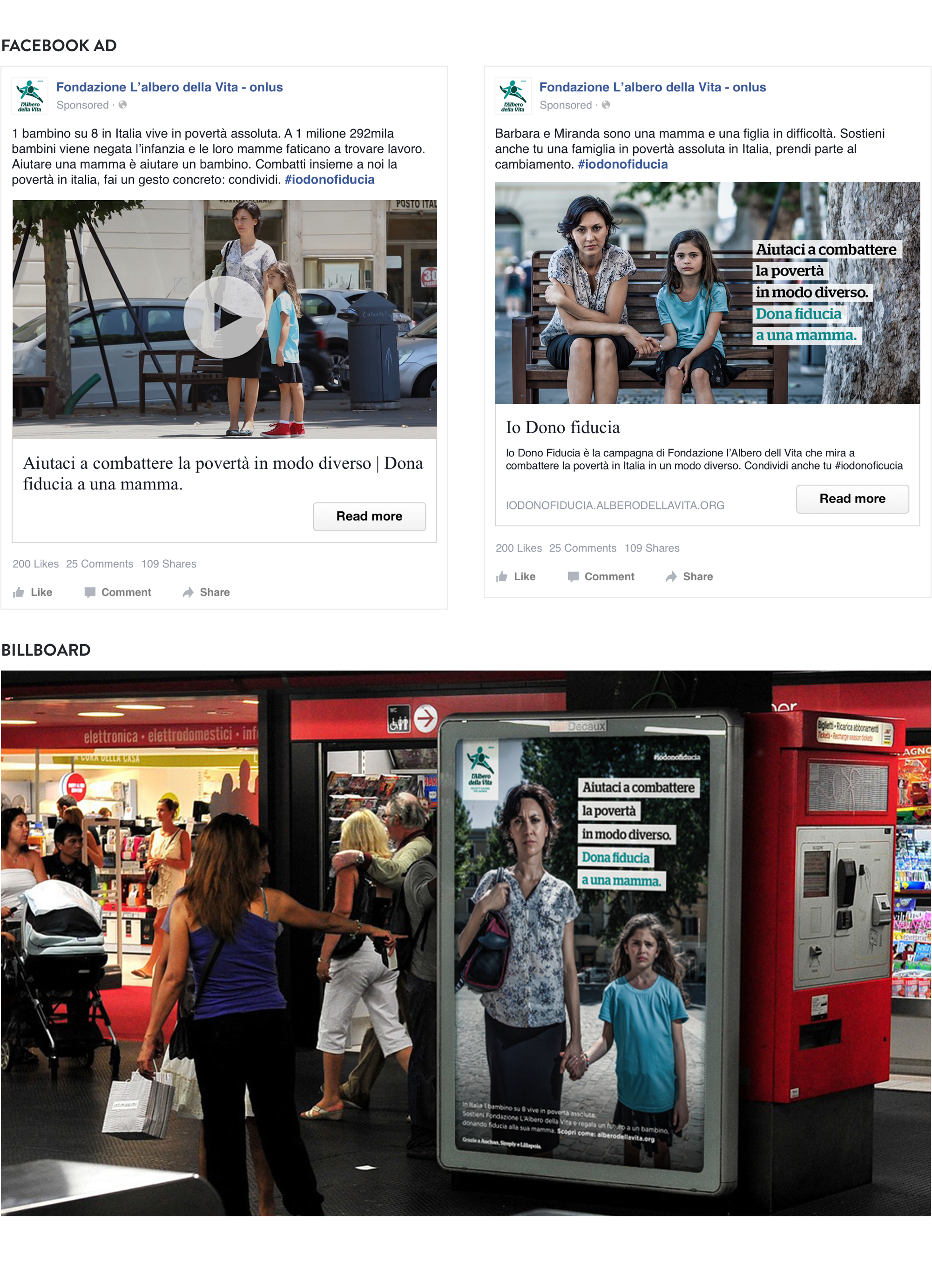
After the success of the organization’s last social experiment, we worked on a new video and a brand new campaign to talk about poverty in a different way: this time the focus is on a young mom and her daughter, but most importantly on the reactions, people show when hearing their request. The aim was to raise awareness around families in Italy and their daily fight against poverty.
Social experiment
An unemployed mother with a little daughter.
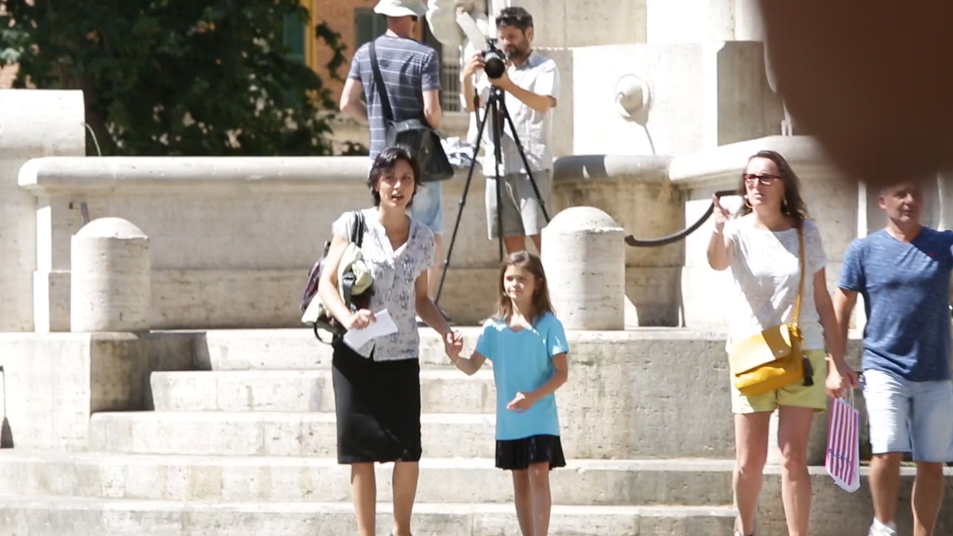
An actress walks around a crowded place in the centre of Rome, with a little girl asking for people’s help.
We wanted to show how desperate a lonely unemployed mother can be, and how poverty can affect anyone.
2 cameras and 1 Go-pro were placed in hidden spots to catch spontaneous reactions from people who passed by: and such reactions were surprisingly positive.

Campaign strategy
Social media campaign and billboards to increase donations.
The social experiment video is part of an integrated communication strategy aimed at increasing online donations to Albero della Vita’s project dedicated to families with limited means.
We developed and implemented a social media paid campaign and we designed visual assets for billboards in public places.
Doctors Without Borders –
This is not my Europe
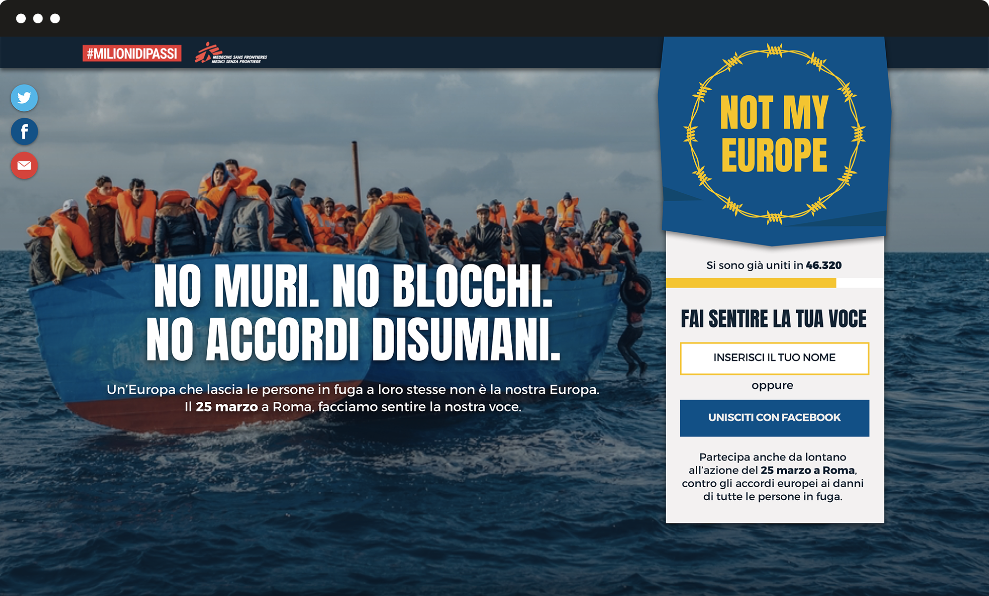
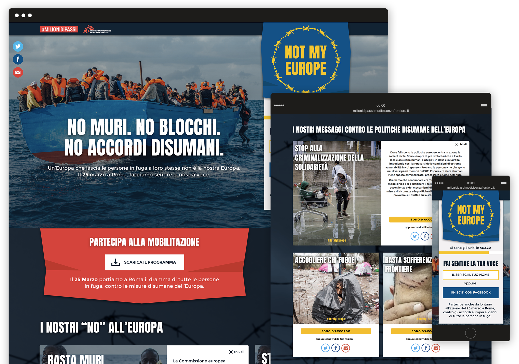
We developed the creative and visual concept and the landing page for Medici Senza Frontiere’s protest action to take the migrants side against EU blocks and walls. We identified the campaign claim and tagline and the campaign visual for the public action of March 25 in Rome, to contrast European leaders policies about forced returns and blocks of migrants and refugees. We designed a landing page to reach participants and engage those that are not able to be there with online activities.
Claim and tagline
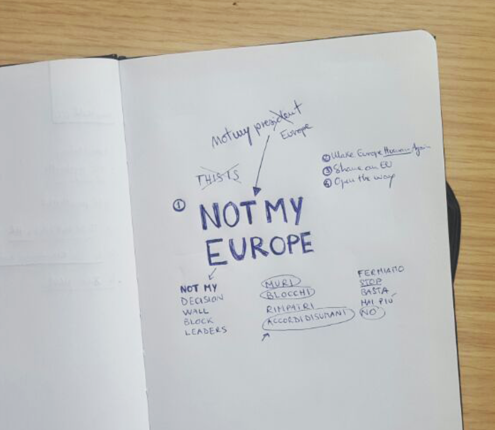
The claim is of an international movement understandable by an Italian audience.
We opted for 3 simple English words that are commonly used in other languages too. These words form an expression that is a popular US slogan often used to address unwanted leaders or to protest against an institution: for example “Not my president” or “Not my government”. “Not my Europe” is the voice of a European citizen that speaks in the first person, on behalf of an international community, who wants to take the distances from the EU policymakers.
The campaign visual
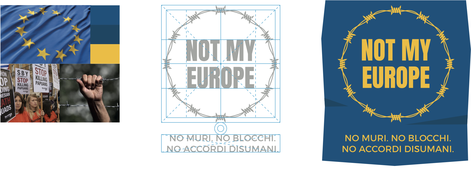
A representation of the recent EU’s policies about migrants and refugees.
We brought some change to the European flag by replacing the stars of the official one with barbed wire in a circular shape.
The wire does not allow anyone to get in: that’s a huge metaphorical contrast with the principle of free movement of persons, that is one of the EU founding principles.
The landing page
A place where people can get informed about the event going on.
On the top of the page, the user can download the program to join the mobilization in Rome or sign in to join the online protest. The page is functional for both offline and online demonstrators.
In the lower part, we put six boxes where users can examine in depth the six reasons why Medici Senza Frontiere and several other organizations are gathering against European policies and than share their agreement to the “Not my Europe” campaign.
Amnesty international Italy –
We take injustice personally
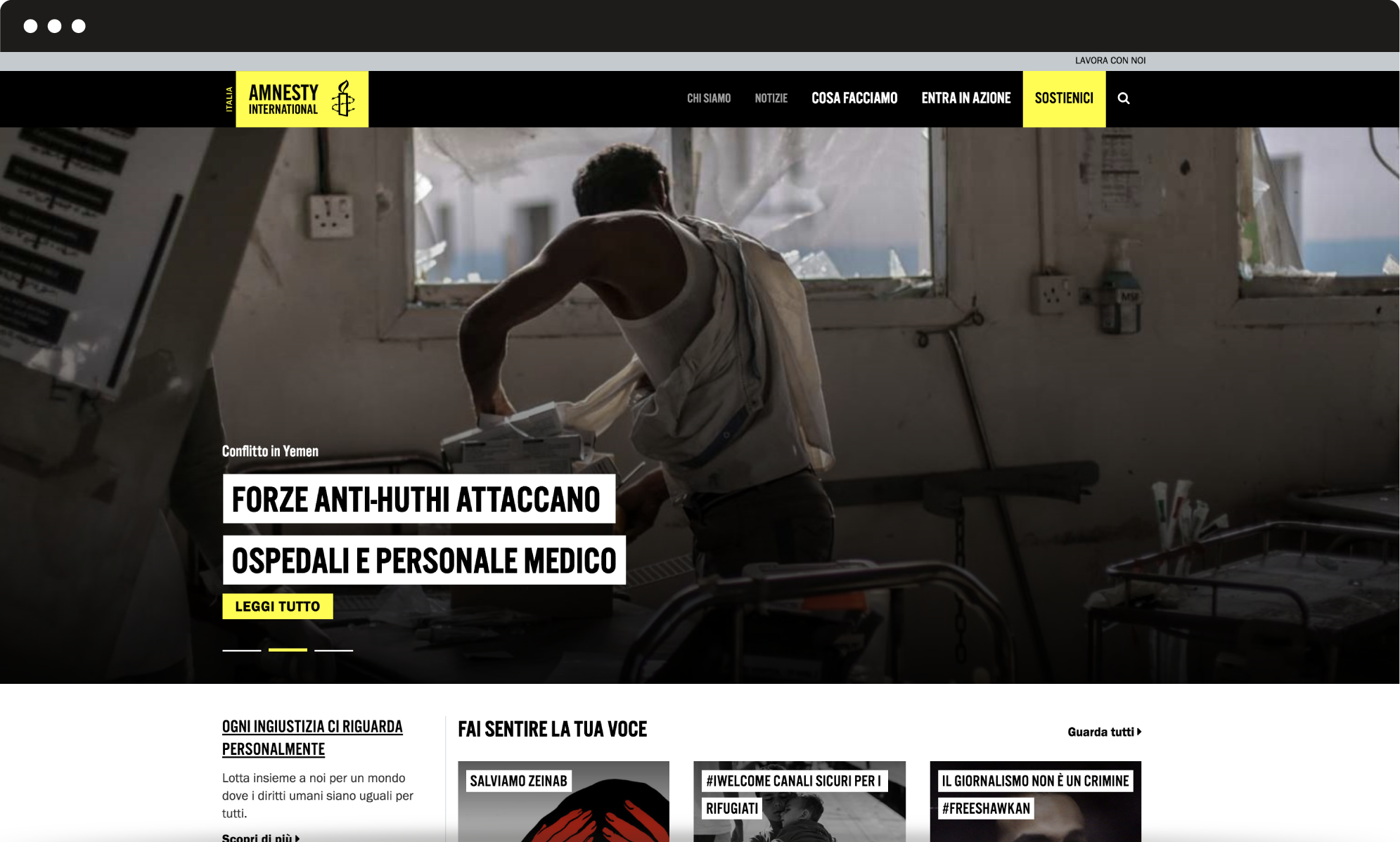
We worked with Amnesty International Italy to redesign their website: our main challenge was to simplify the user experience and optimize the information structure. The first step towards a redesign of the user experience. We identified scenarios, personas, activities to meet the user’s needs.
Human centered design
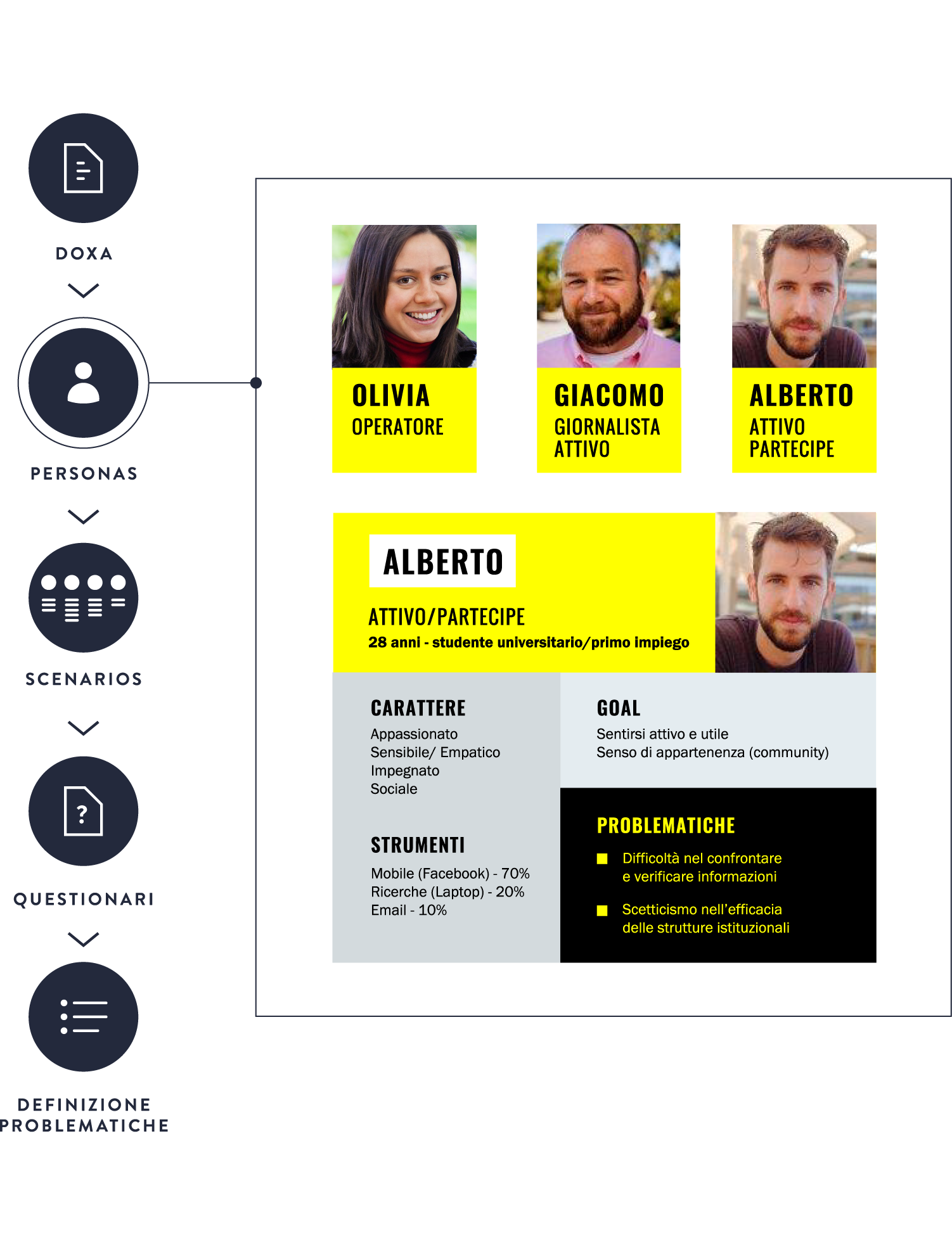
Who is the user of Amnesty International Italia website and what does she/he look for?
Answering such questions was the first step towards a redesign of the user experience. Through an accurate user research based on a poll and several tests, we were able to identify scenarios and personas, define high-priority activities and effectively meet the user’s needs.
Information architecture
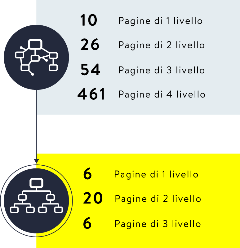
A simplified user flow that allows actions and offers information.
Amnesty International website is a multi-layered environment: we simplified the user flow by reducing first-level pages and optimizing the organization of second-level and additional pages. Thanks to internal shortcuts and the search function, users can easily move from information to action.
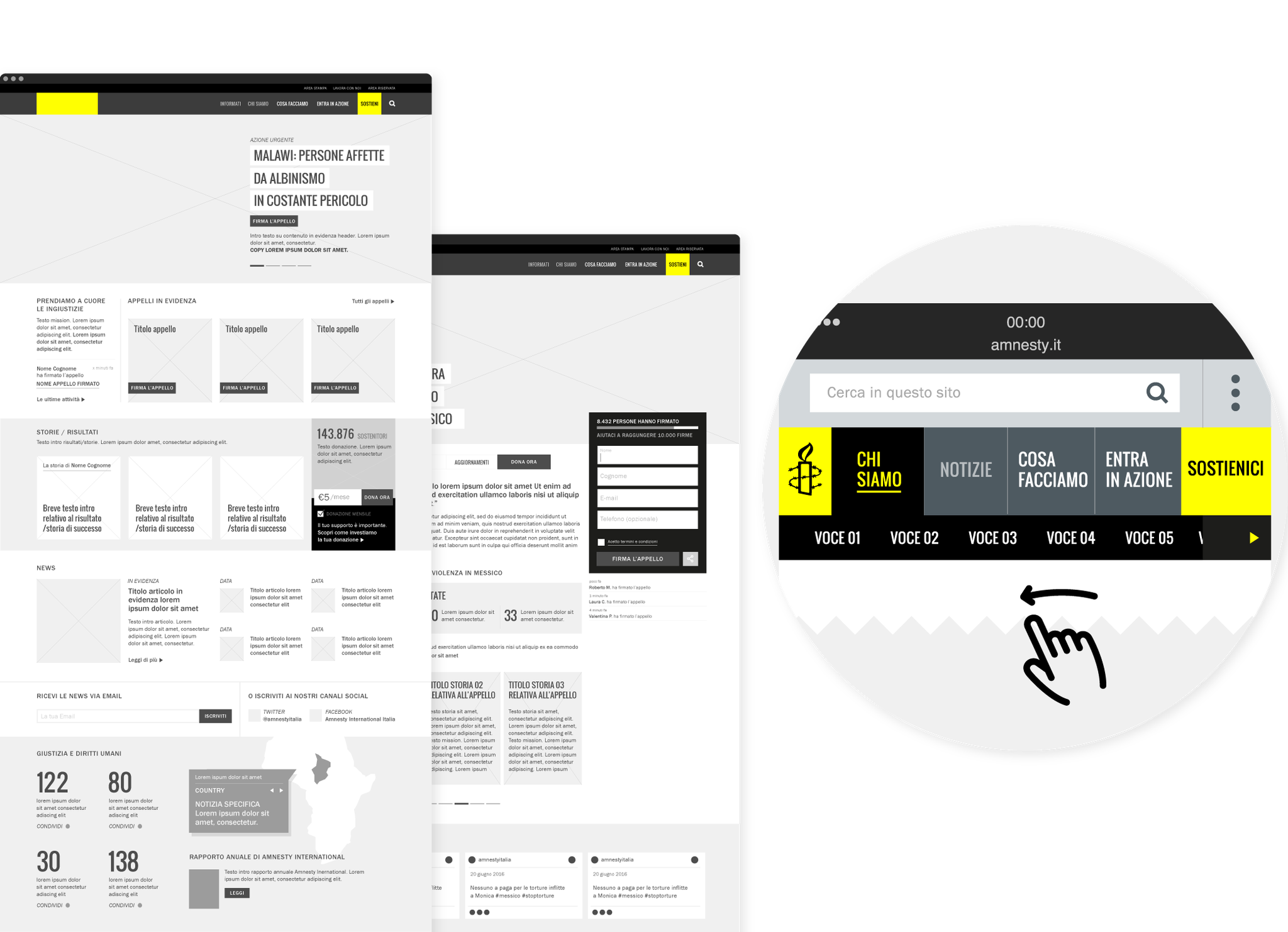
User experience
A unified experience and user recognition.
Today web users are multi-screen users, thus we designed a unified experience, which provides a coherent passage from one device to another: you can start a session on your desktop computer and complete it from mobile. We implemented the signing-up flow with specific features, such as the recognition of the user and his/her previous actions.
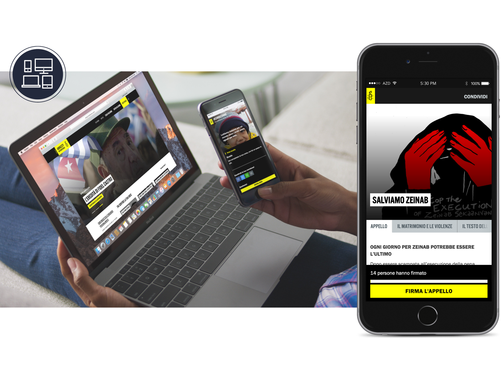
User interface
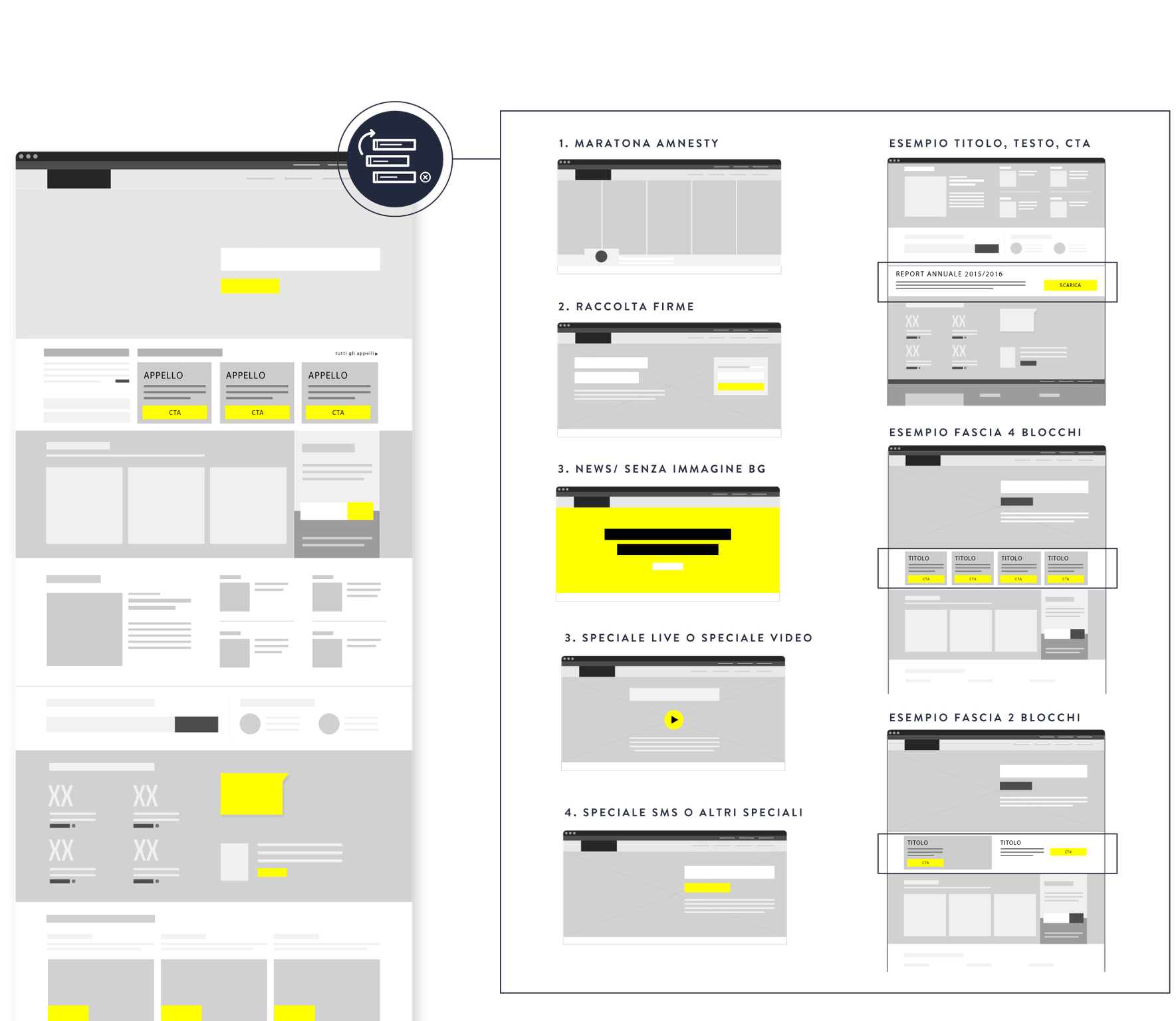
A flexible and maintainable interface.
Amnesty International Italia is a dynamic website that needs to be frequently updated: new actions, campaigns and petitions are the main tools to fight for human rights. We designed a flexible and maintainable interface based on customizable templates, which can easily be adjusted to any specific situation.
Housing Europe –
Our homes are where Europe’s future starts
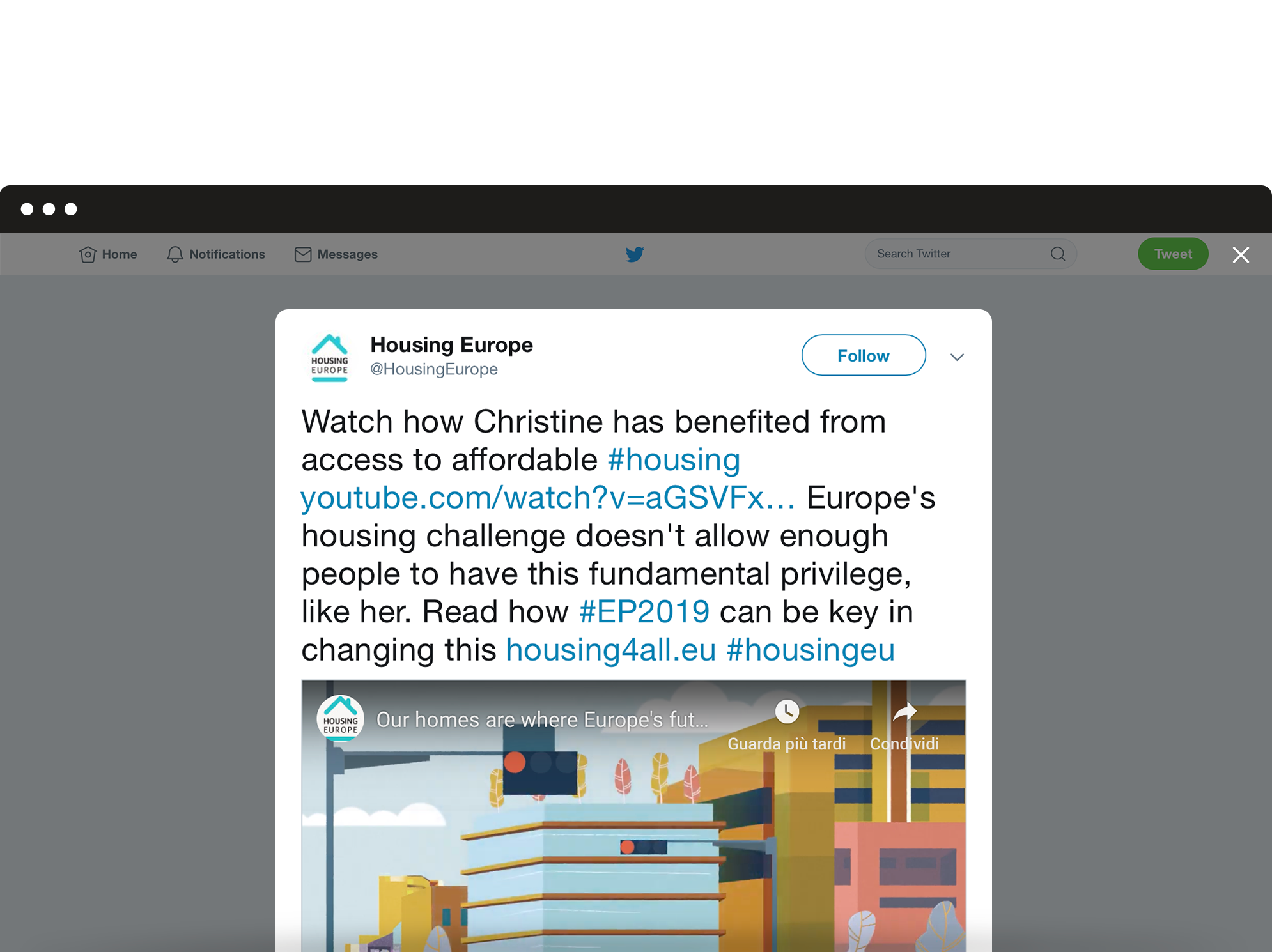
At a time when Europe is confronted with a major housing challenge, Housing Europe presents its campaign for the European Elections 2019. We produced this 2D animated video to show how more people can access affordable housing. The video shows us some of the multiple benefits of living in public, cooperative and social housing, leading up to the call for further support at EU level on the occasion of the Elections.
Narrative choice
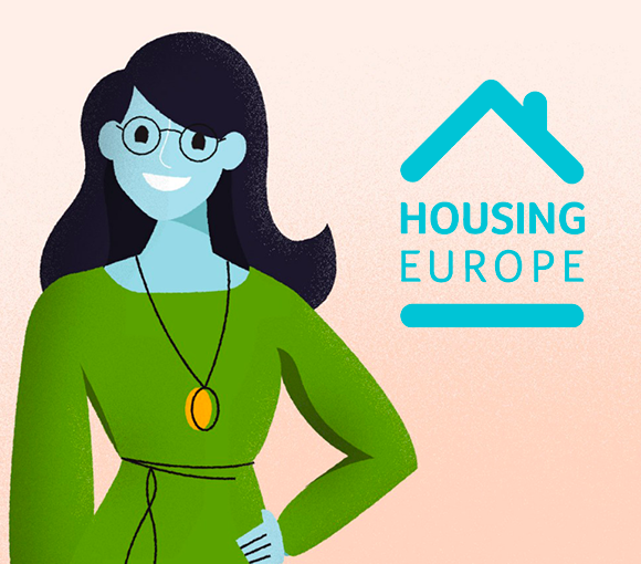
For the storytelling structure, we chose a personal perspective in order to create a sense of familiarity in the audience’s mind.
The video thus represents the narrative journey of Christine’s experience in Social Housing, showing its positive outcomes through her point of view.
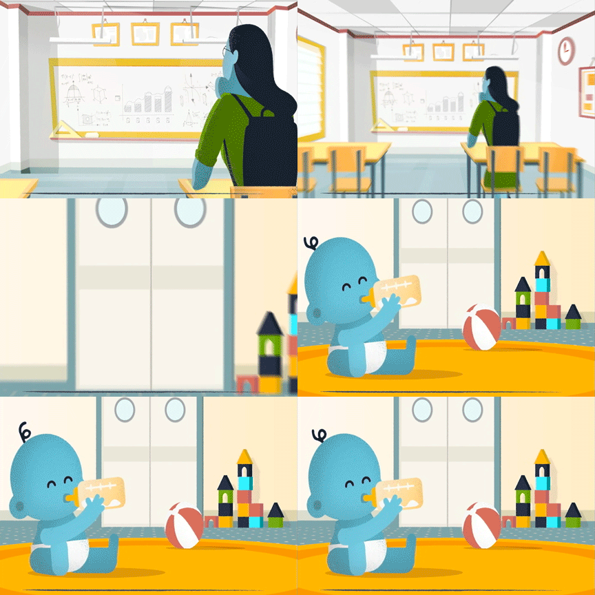

Visual identity
In addition to being based on the most recent 2D animation’s techniques, the video embodies a fresh and vibrant mood. For its visual identity, we chose a sketchy-illustrated style and pastel shades, suitable for a young target.
A change of direction –
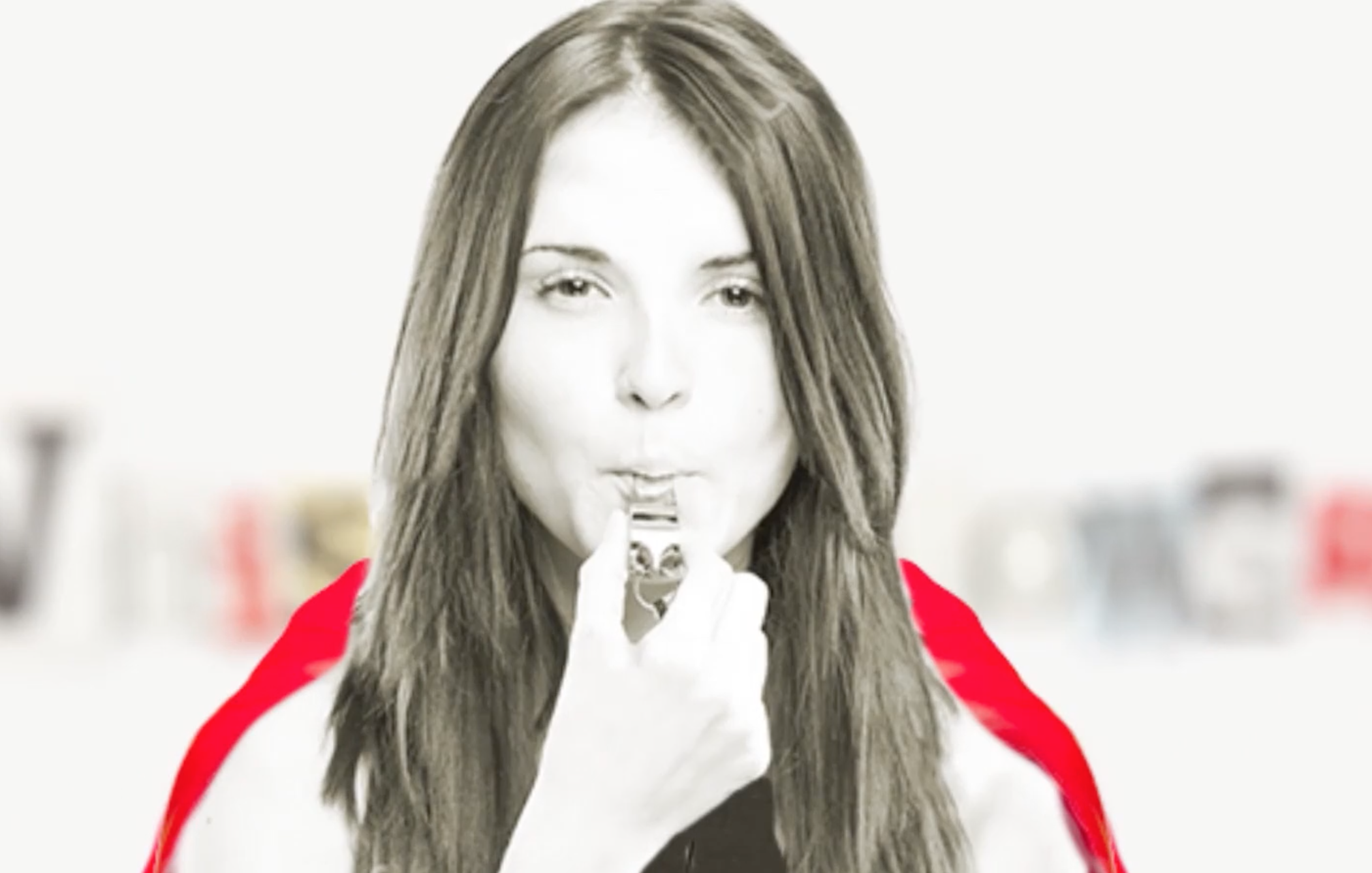
What does it take to be a whistleblower?
A change of directions is committed to safeguarding the rights of those who report in Europe from abuses and threats.
We designed a website and we produced 8 videos to explain the project and to report misconduct within governments and companies. We adopted an informative and engaging tone to invite organizations to fight corruption together.
Motion graphic
For this video we combined mixed animation techniques: motion graphics and frame by frame footage animation, to let the audience feel a deeper involvement and develop a stronger internal point of view.
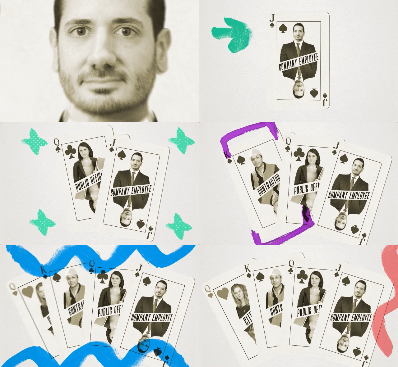

Multiple targets
The campaign targets different audiences: stakeholders, institutions, NGOs, schools, as well as a generic segment of citizens who need more information. The video addresses all targets and provides a clear view of the issues related to corruption, and it ends with a call to action directly aimed at the institutions
Council of Europe
No hate speech movement
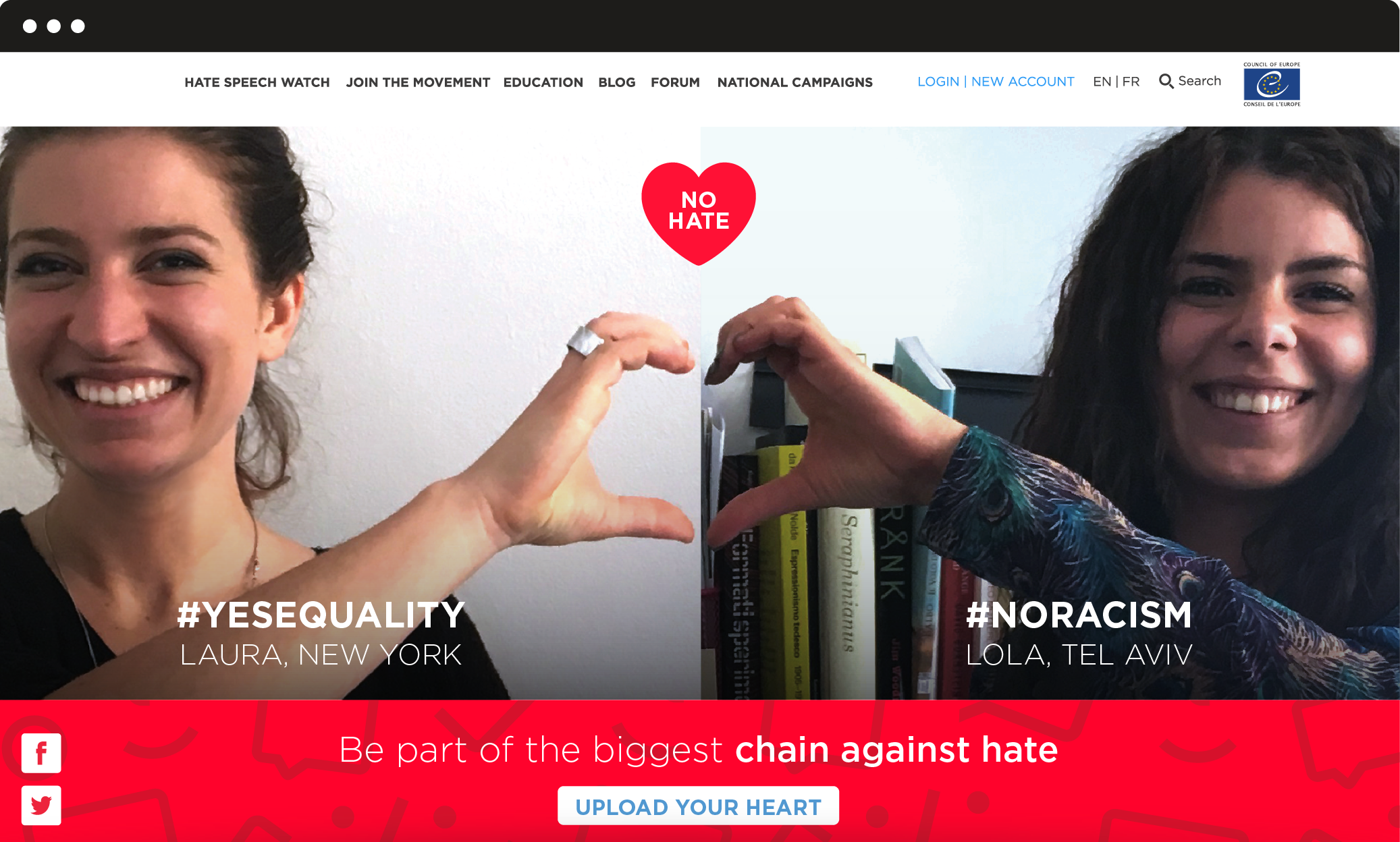
The Council of Europe asked us to design a campaign to empower European youth in taking action against hate speech online. We created No Hate Speech Movement concept, identity and web platform. Young people are both the target and the main actors. We designed a website, developed on a LAMP based platform, and interactive tools.
Visual identity
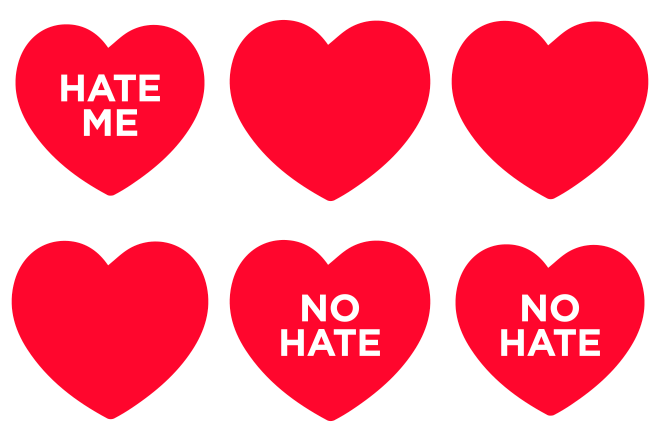
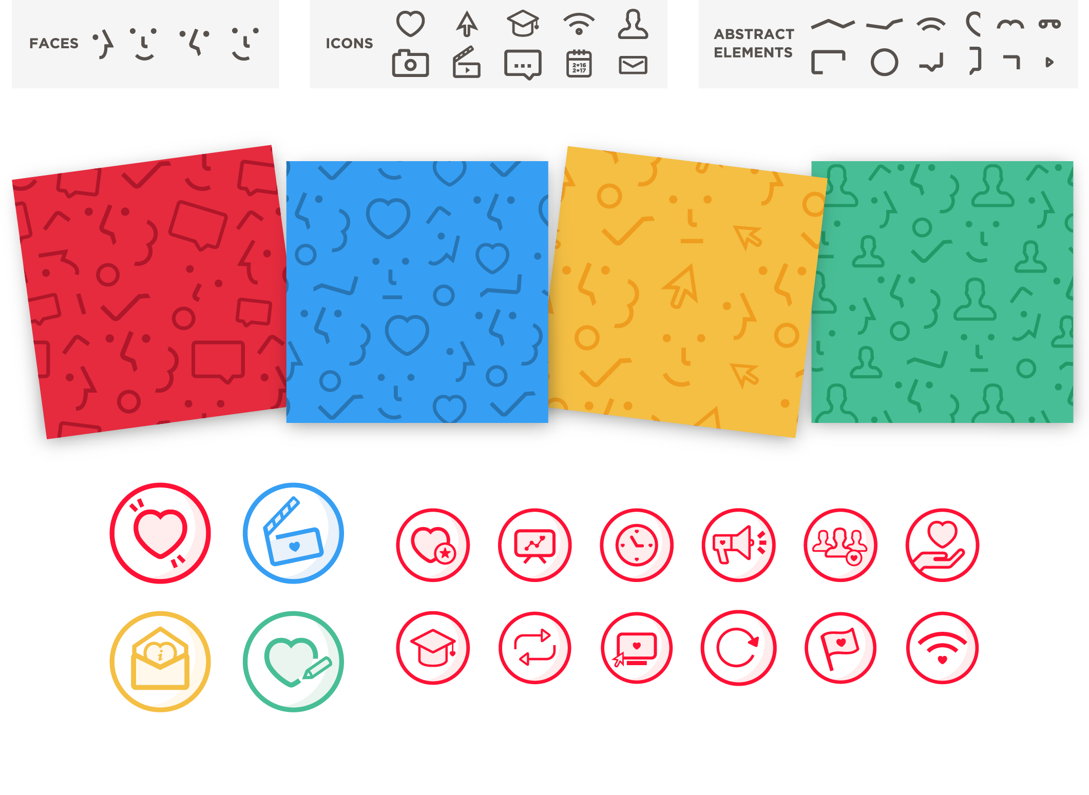
We designed the No Hate heart logo to spread the campaign’s positive message among young people of different cultures and languages. In the first graphic proposal we utilized a logo animated version, that reflected different aspects of hate speech. In the 2016 update, to enhance the brand awareness of the campaign, we realized patterns composed by two main elements: icons and faces, that recall the actions available on the platform and the community dimension.
Costume maid CMS
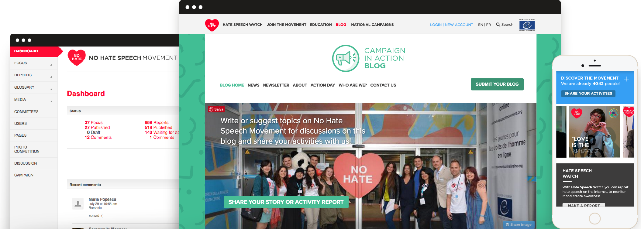
We have developed a Content Management System tailored on the needs of the Council of Europe itself. A custom software allows high flexibility, ease-of-use, increased security and the possibility for us to provide extended future support. The result is a high performance website with complex and diverse functions, a very flexible online environment that can be extended and customized according to the needs of the campaign.
Intuitive user experience
We designed a user-generated content experience inspired by the heart logo. Through an interactive Web App, linked to personal computer camera, users are easily guided to upload their own pictures and associate a personal No Hate #WORD. These pictures appear on the navigable interactive homepage: the result is a never ending No Hate Chain, made by faces and thoughts connected to each others.
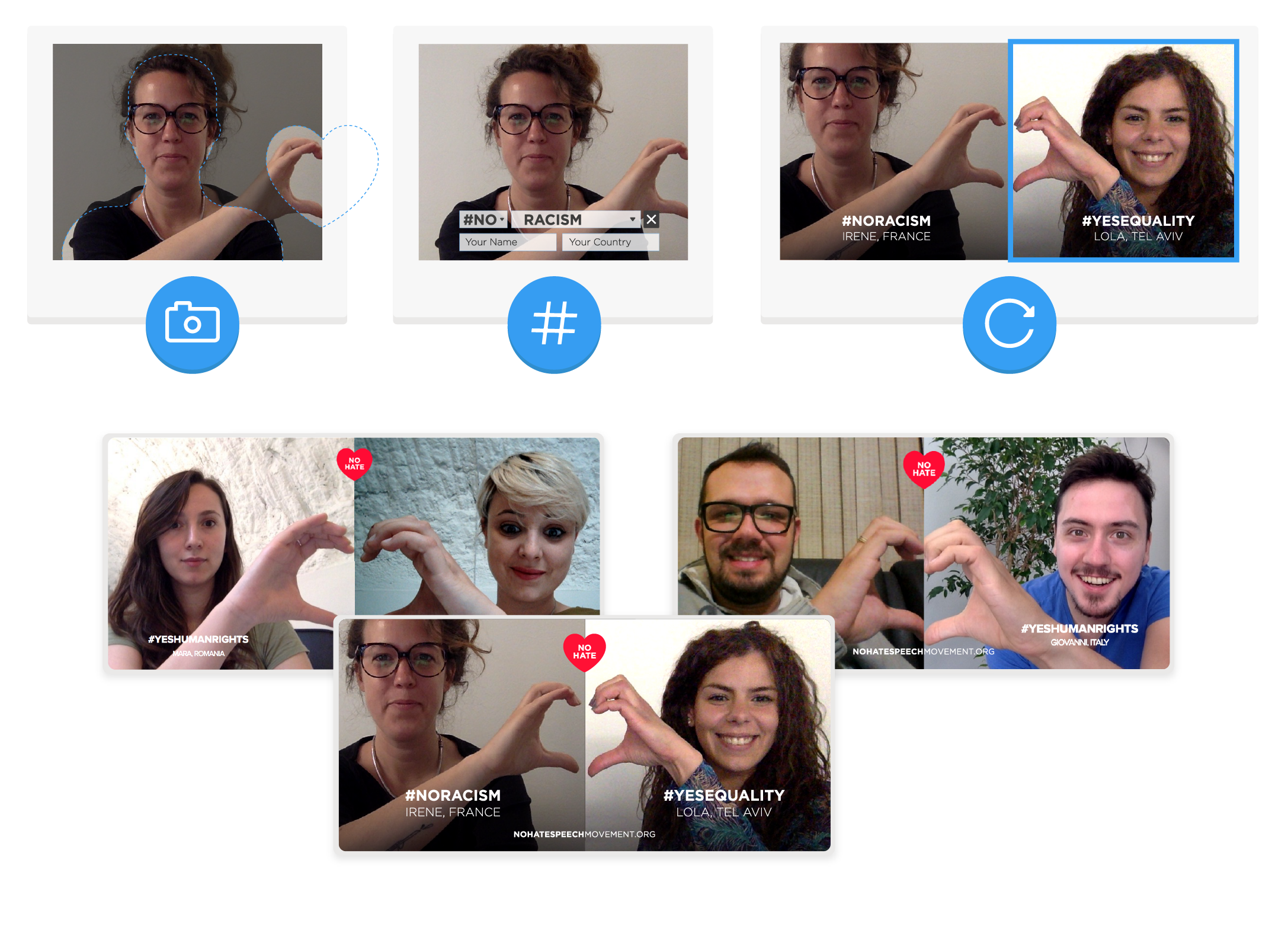
User engagement
The NoHate activities available on the platform are organized and optimized to generate an increasing level of user’s engagement. Users can suggest and write posts for the blog and also become NoHate activists, by reporting hate speech online through the dedicated tool. National campaigns from all the countries involved in the movement are reachable through an interactive map, showing contact information. The action can continue offline.
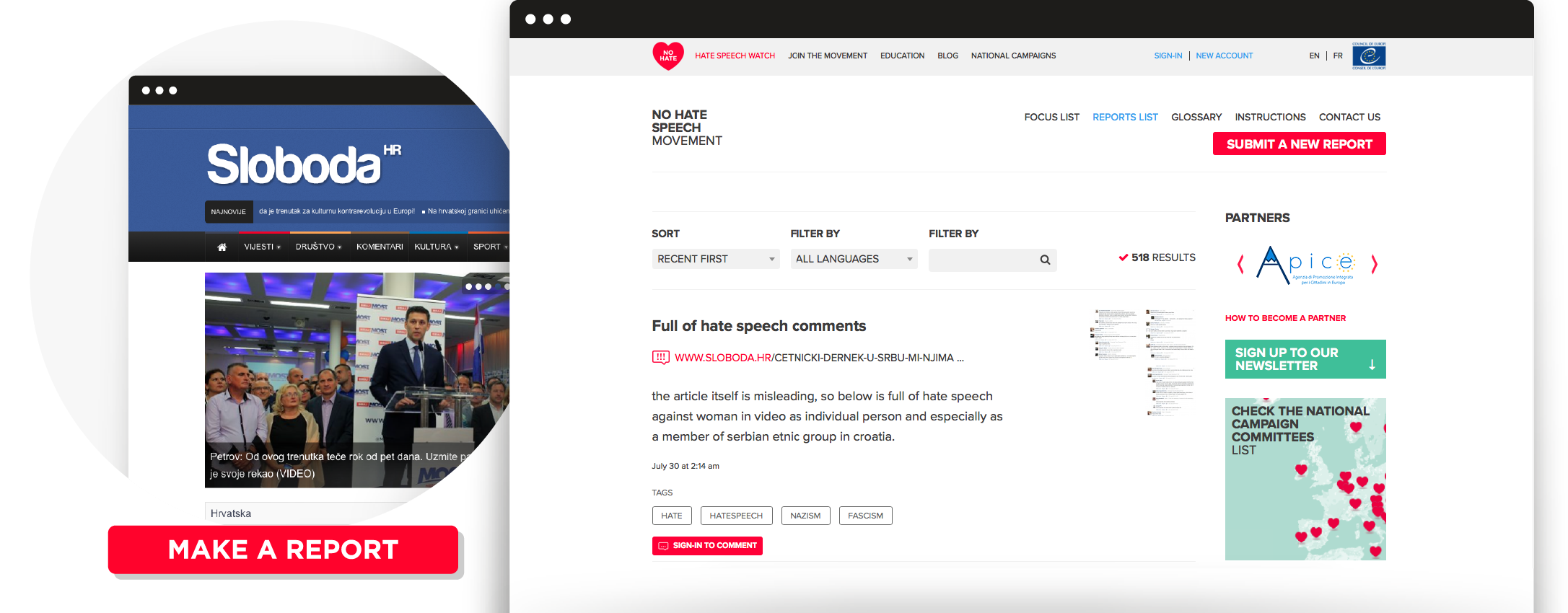
CEJI –
Do you know what a hate crime is?
To prevent bias-based hate crimes from happening at all, we need to know how to recognize them and to collect data in order to better understand the problem and protect past, present and future victims. The challenge of this campaign was to convey the same message to very different targets: civil society, institutions and teenagers. For this reason, it had to be emotional and accurate at the same time.
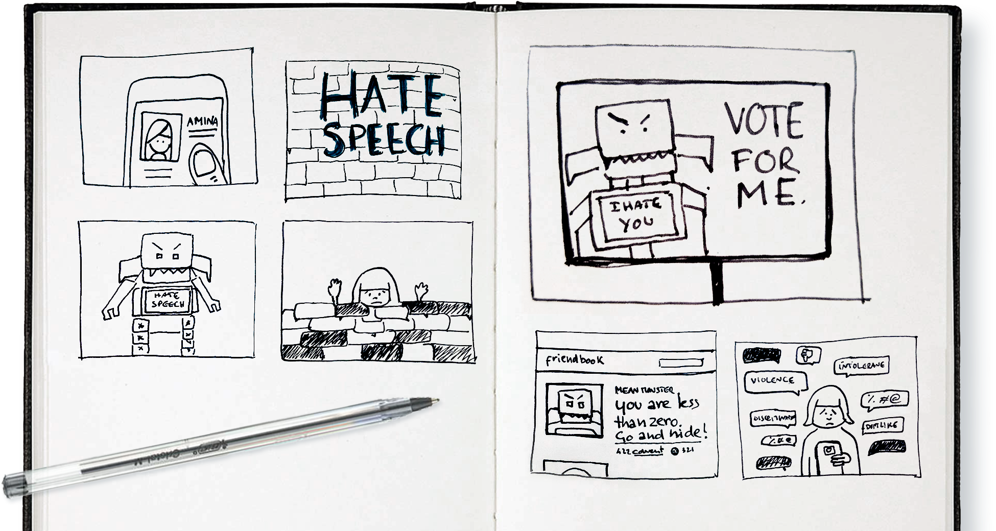
Video
A clear definition of hate crimes.
In order to increase the awareness around hate crimes, we created a script that provides a clear definition of them and engages the audience by emphasizing the importance of reporting.
This motion graphic video is part of the Facing Facts campaign, promoted by Ceji and aimed to make hate crimes visible to everyone.
Character animation
We were asked to represent the different categories of people.
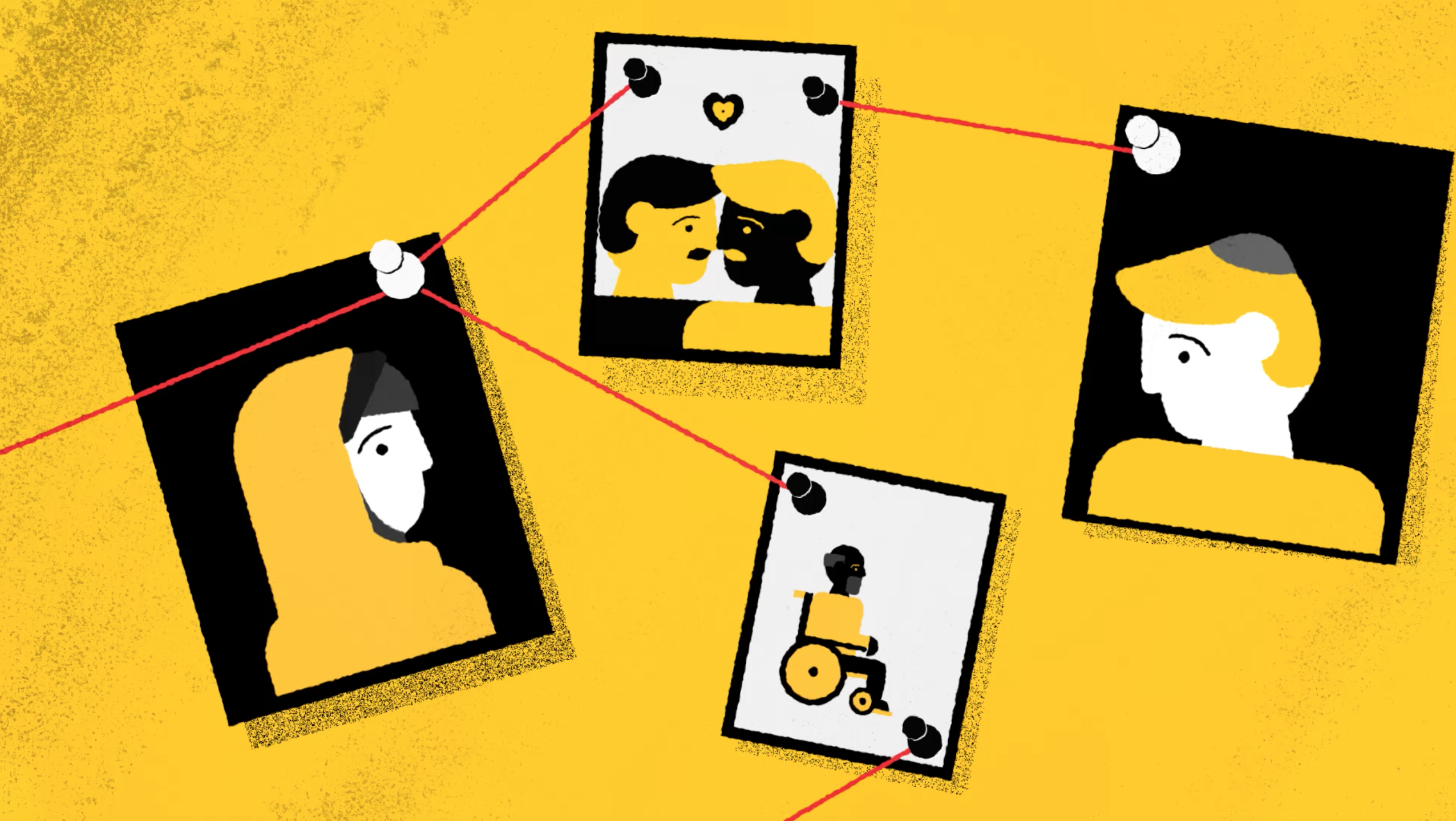
Another challenge concerned the representation of crimes and their protagonists: to avoid extreme language and violent scenes we had to come up with several metaphors, such as the crime pinned board and the target shapes. On the other hand, since hate crimes are based on bias and discrimination of ethnicity, age, gender, sexual orientation, we were asked to represent the different categories of people: wide research led us to find simple, neutral face and body shapes to which we added some details and changed the main colours so that all physiognomies could be symbolically represented.
Subtitles
English subtitles for a deaf audience.
We also provided English subtitles for a deaf audience, transposing sound effects and music variations and adapting the script to the standard length and difficulties for these viewers.
Terre des Hommes Italy –
Let’s protect children together
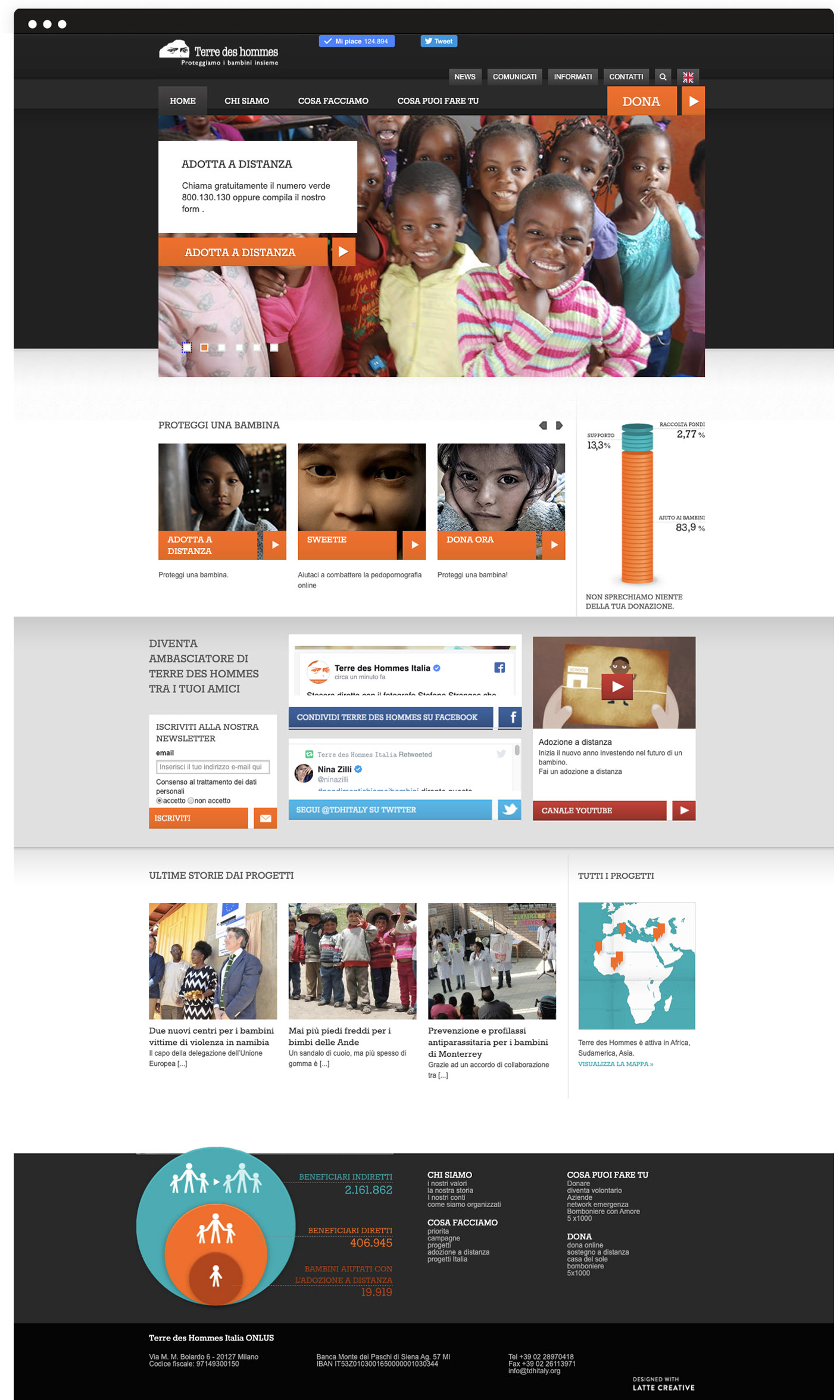
Terre des Hommes protects children from violence and abuse, to guarantee the fundamental rights. They were in need of a new website to present themselves and their values with better impact, involve the community in their activities and to inform about the implemented projects.
Website
We designed a brand new website and developed a LAMP-based internet platform.
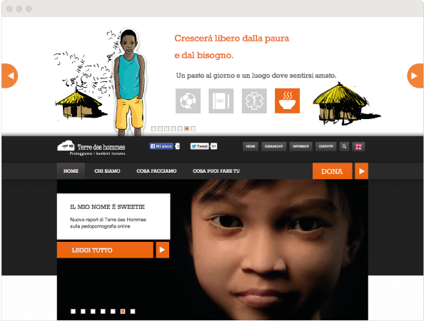
Our aims were to display Terre Des Hommes’ values effectively, to engage people in their mission and to make information about their objectives and projects clear and easy to access. We used visuals and infographics to simplify all the information.
Also, to create greater interest for donations, to directly reach and stimulate the donors we composed a sliding illustrated straightforward story using holistically a playful style.
Tax justice network –
Global alliance for tax justice
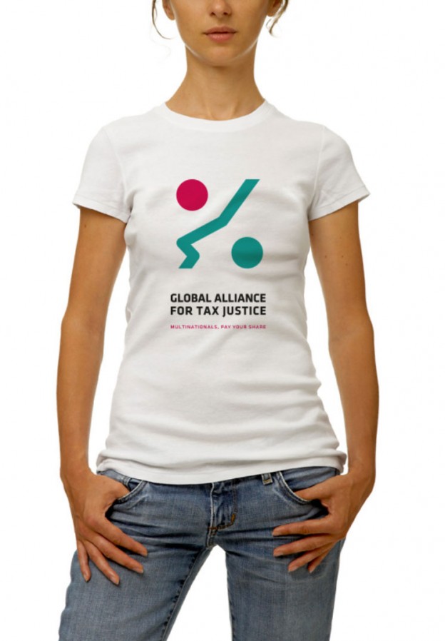
We collaborated with the Tax Justice Network, one of the most significant actors in raising awareness around tax justice on an international level, to design a logo for their new umbrella organization: the Global Alliance for Tax Justice. The Tax Justice Network mostly focuses on research and advocacy and it’s also active in creating partnerships with many campaigns, both on a local and a global level.
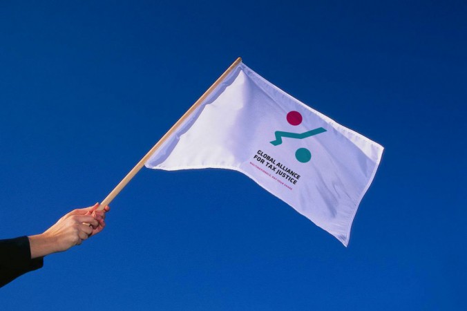
GATJ is a newly formed alliance of autonomous regional networks working together for shared objectives in solidarity based on equality. Each regional network leads the fight against tax dodging within its own regional political and socio-economic context, and the alliance comes in to support the regional work, to amplify and synergies the regional work at the global level.

Brand identity
We gave tax justice one of the most important human attributes: a face.
The goal was to create a logo that would be both recognizable and credible, a common symbol for the Alliance. As tax justice is sometimes hard to grasp, we tried to give a positive spin to the subject. The expression is friendly and the profile is obtained by using the universal symbol of portions. Through the merge of these two simple and well recognizable shapes, we managed to convey the idea of fairness: tax justice, for all. The values and the mission of the alliance are reinforced by a direct and incentive pay-off: Multinationals Pay Your Fair Share! The idiom makes this sentence easy to remember and serves as a clear call to action.
