Technology: brand identity
Restarting the future –
A generation against corruption
The “Restarting the future tour” is a special project launched by “Restarting the future”, the largest Italian digital community that has been fighting for years to defeat corruption in our country.
Our challenge was to create and share a multimedia narrations about everyday anti-corruption heroes.
Brand identity
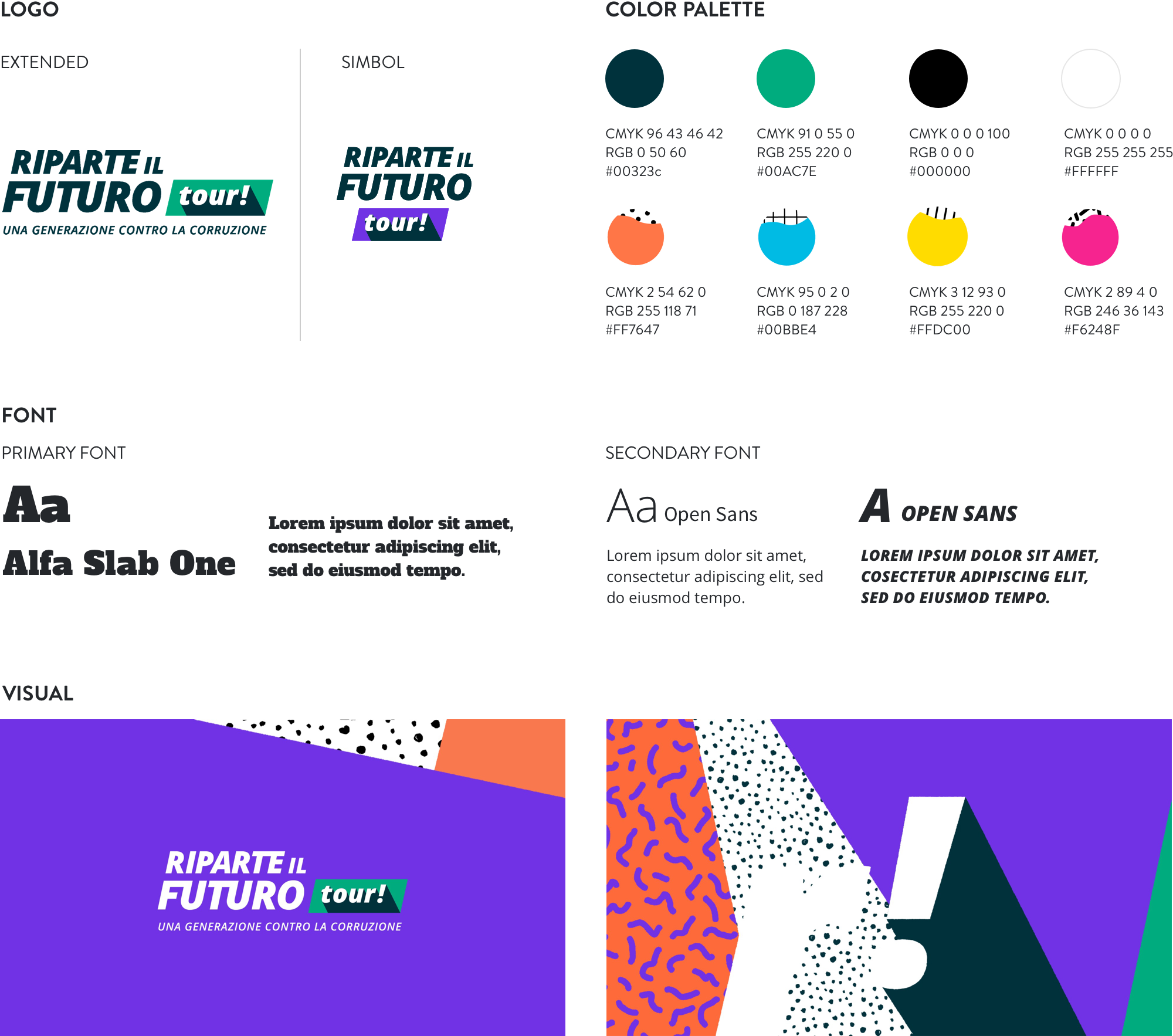
A dynamic and colourful identity.
Since we had built the website for “Restarting the future” a while back, we could carry out the previous branding process, integrating new elements based on the tour’s features and scope. To do so, we chose a dynamic and colourful identity, which reflects the target’s attributes: mostly under the 30s.
Website
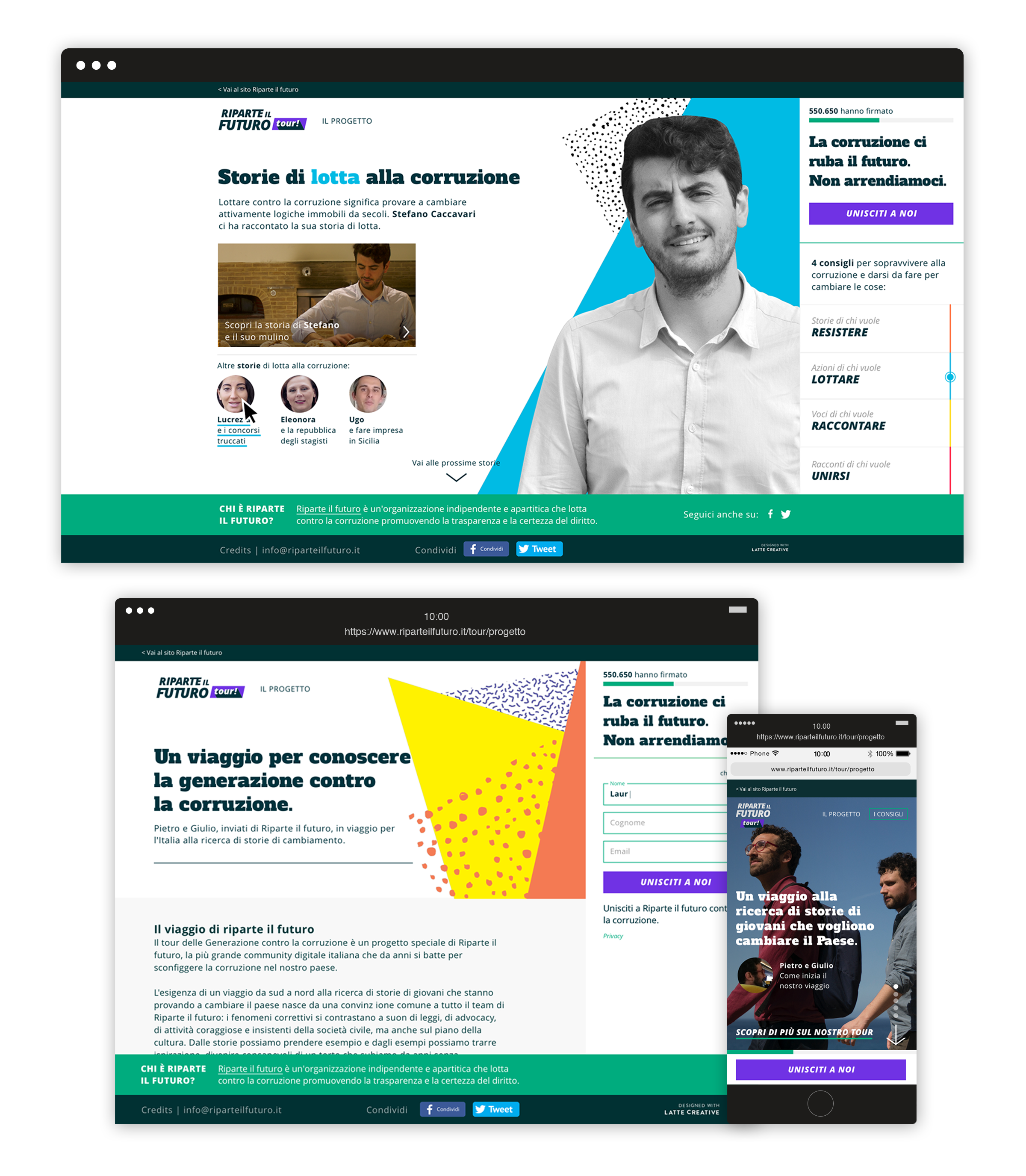
An interactive platform.
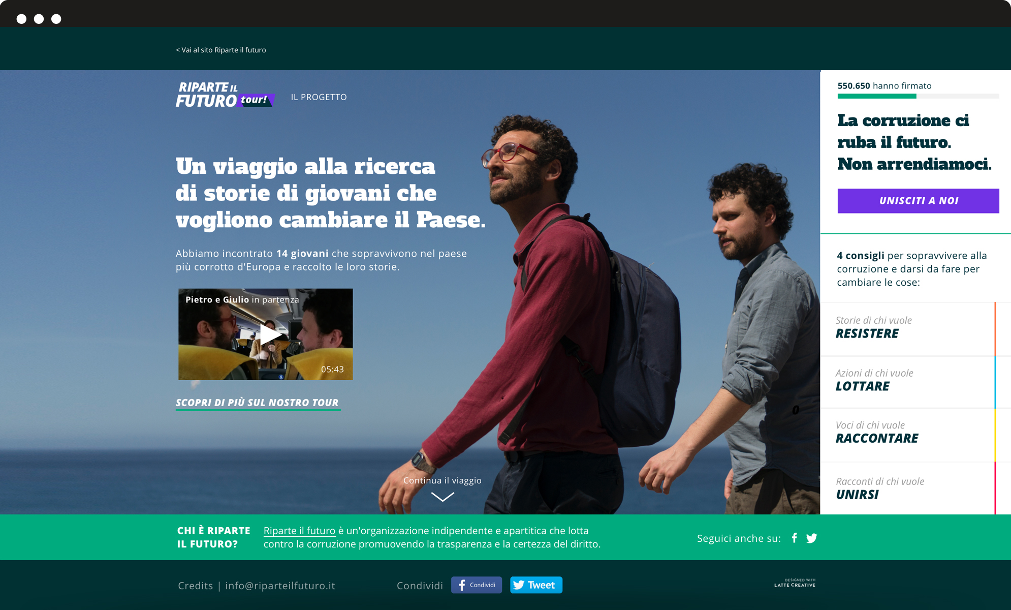
For the website we created an interactive platform, split into four subsequent sections. All sections are based on a set of concrete actions that users are encouraged to undertake: to resist, to fight, to narrate and to join. We shaped a reporting tour around the Country, documenting stories and collecting them on a dedicated interactive platform.
Docuvideo
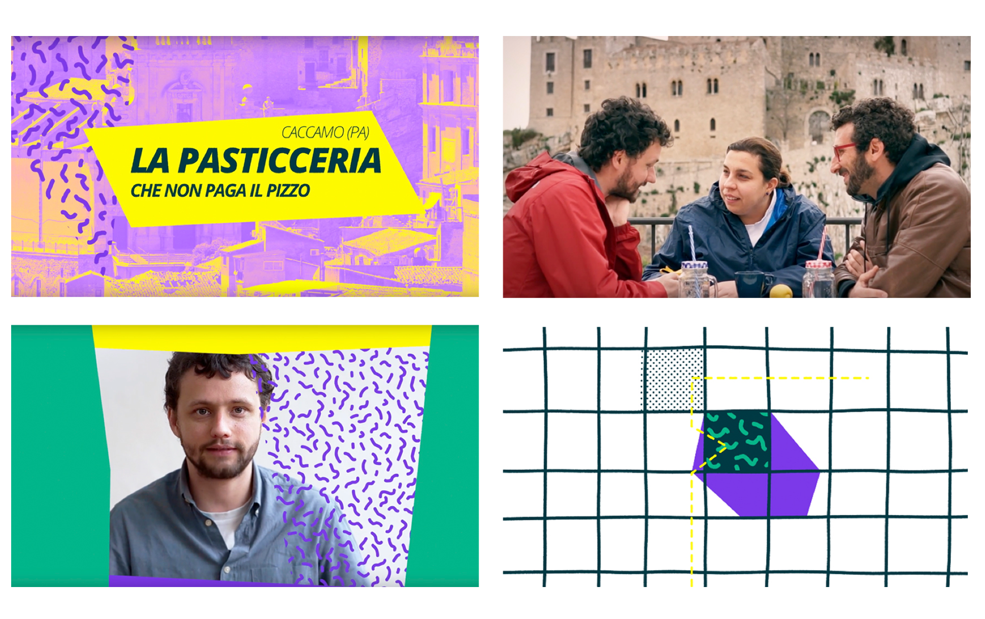
We tracked down, found and met 11 young Italian heroes. They inspire people that constantly fight for their beliefs and for the welfare of our country.
Videos truly fulfill the reporting goal of the project and ensure greater engagement. The long and exciting quest was supported by the work of the investigative journalist Vittoria Iacovella, the award-winning director Giulia Amati and a professional troupe.
Our stories have met great media coverage, as they were shared by many people on social media and posted in a series of weekly appointments on the Italian newspaper “Il Fatto Quotidiano”.
Compagnia di San Paolo Foundation –
Riconnessioni: a school for the future
Riconnessioni is a project that wants to bring systemic change to primary and lower secondary schools.
All the pieces perfectly fit together: new brand identity for the project, an elaborate website for multiple audiences (teachers, parents, stakeholders, and the general public), an animated promotional video and a communication plan supported by print and digital assets.
Brand identity
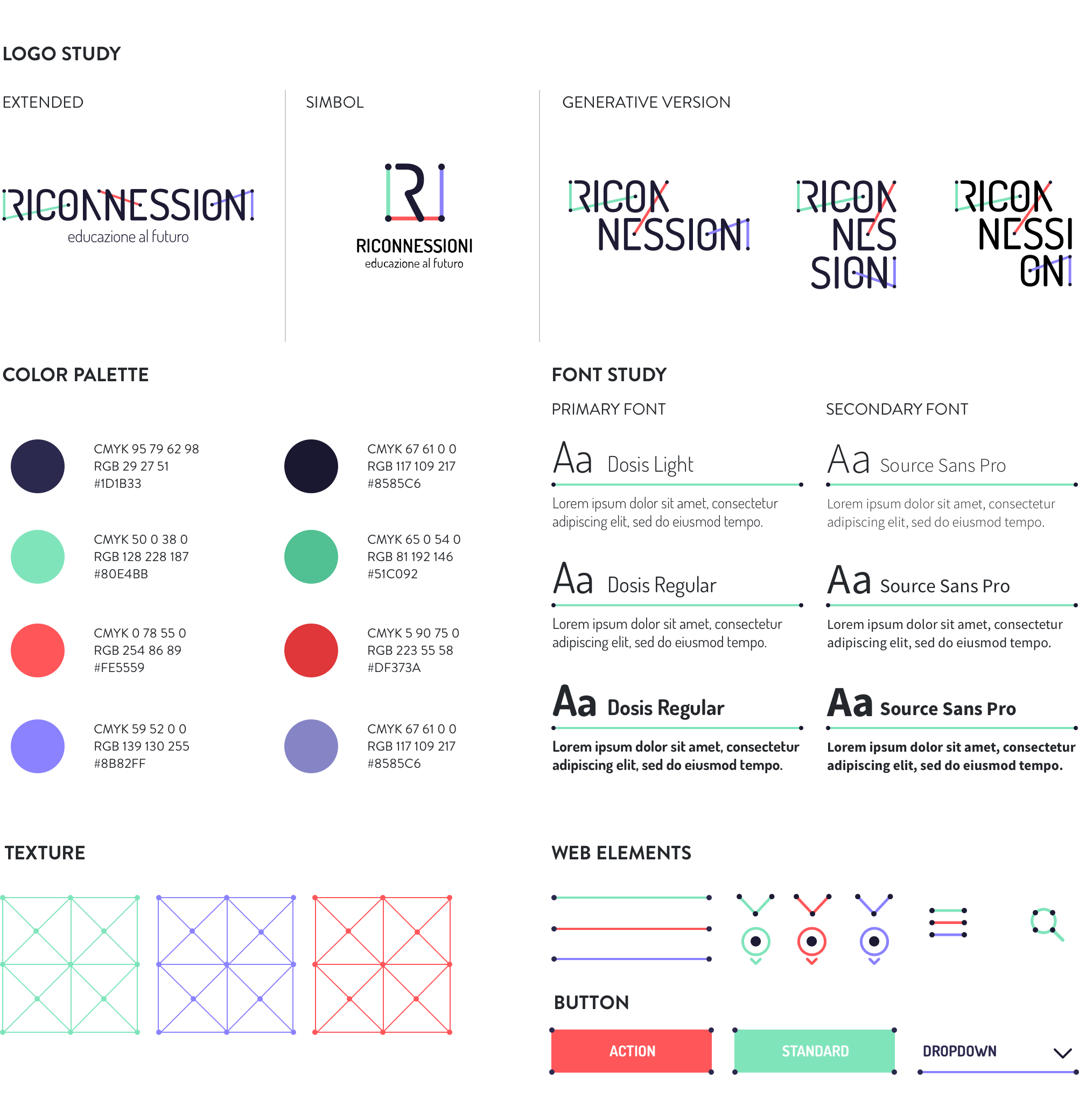
An impactful and communicative logo able to show the three faces of the project: digital, education, community.
We worked on the typography to emphasize the concepts of connection and collaboration, which are recalled by the network of coloured segments connecting the dots within the title. The graphic treatment allows for several declinations of the logotype itself and graphic paths (icons, texture), while the ratio behind the segments ensures homogeneity and consistency. The result is immediate, simple, readable, recognizable and extremely flexible.
Website
A website for many audiences.
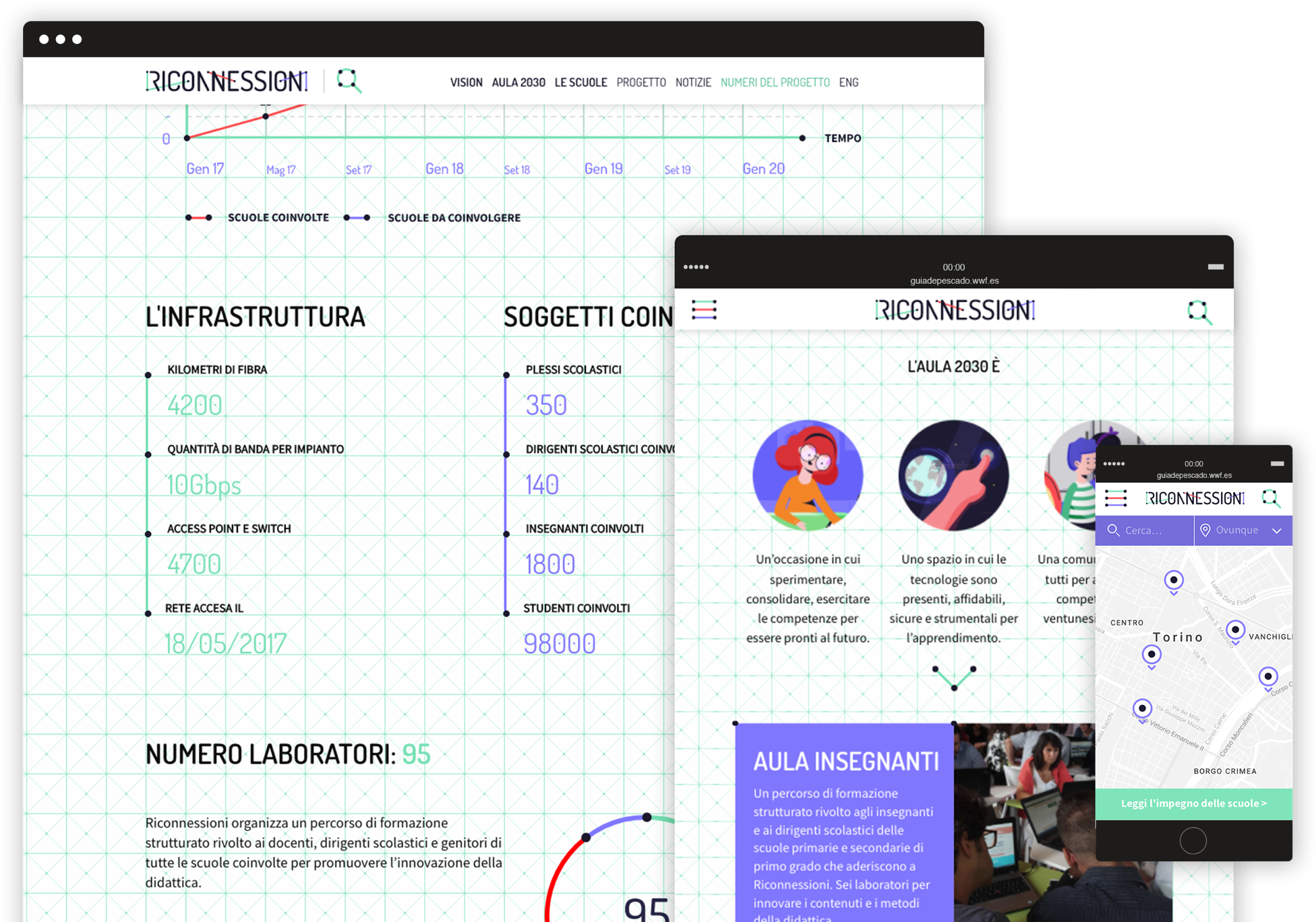
Riconnessioni is made by and for teachers, headmasters, parents, kids, institutional stakeholders, and a number of professionals from different areas of expertise. All these segments need to easily find the right contents on the website, navigate through the pages, interact with articles and be able to retrieve useful information in a few clicks.
Animated video
The story of Viola looking for her future.
We produced a 2D animated video addressed to all the target audiences involved in the project. The smooth and emotional characters animation helps to explain complex technical and pedagogical issues, by telling the story of Viola, a little girl who is looking forward to discovering her exciting professional future!
Engaging the community
From smiling to discussing, from liking to resharing.
After a careful analysis of the different target segments we wanted to reach through social media, we created an animated video and 3 series of cards in which catchy graphics and fun copywriting engage the audience on different levels.
A fresh way to explain the project and invite people to become part of the community!
C.N.G.E.I. –
Between past and future
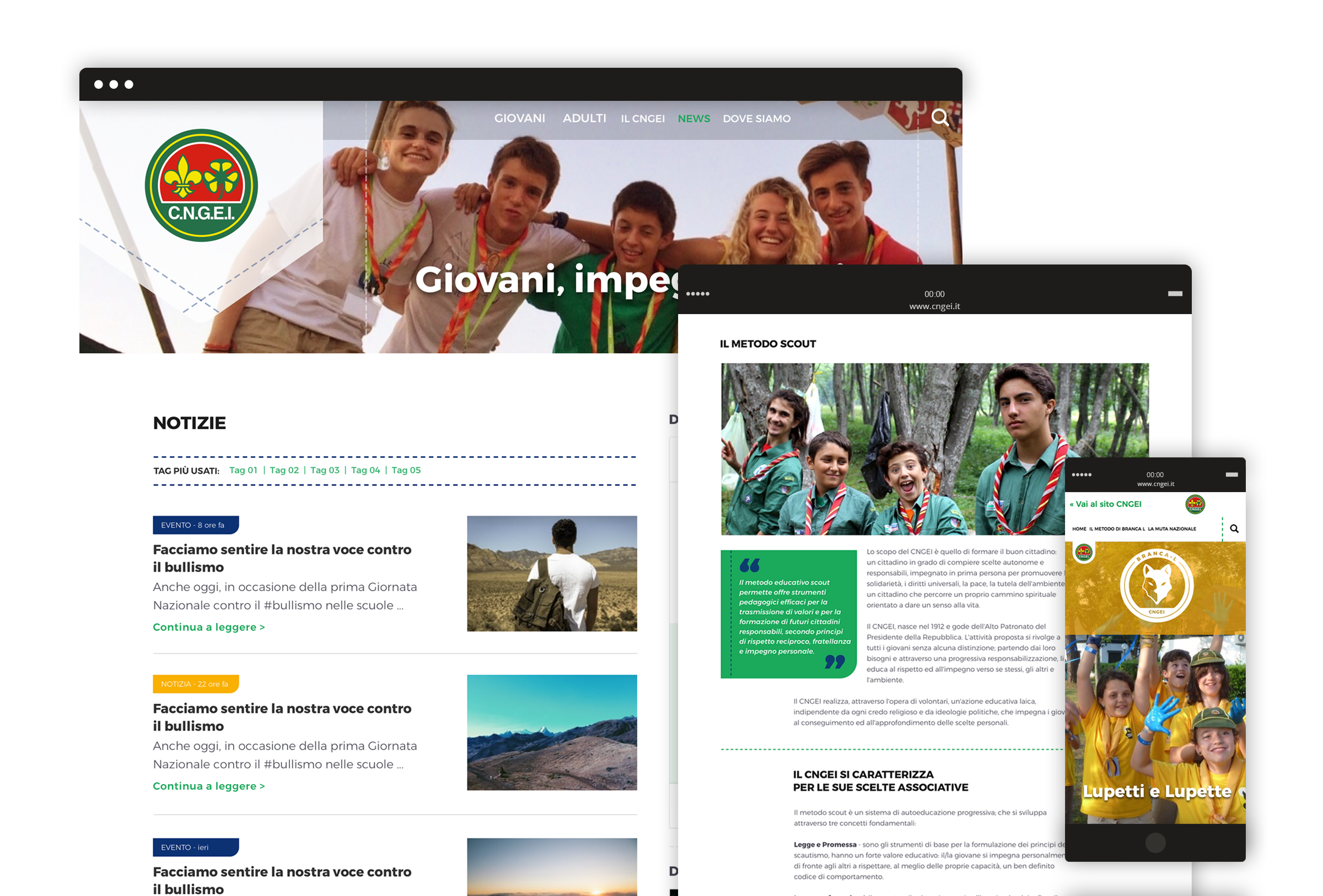
Our challenge was to restyle the visual identity of the CNGEI association, creating a system for both online and offline communication able to preserve traditional symbols while also moving them towards the future.
Brand identity
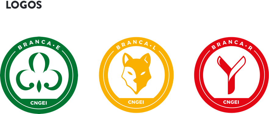
New logos for each section and branch.
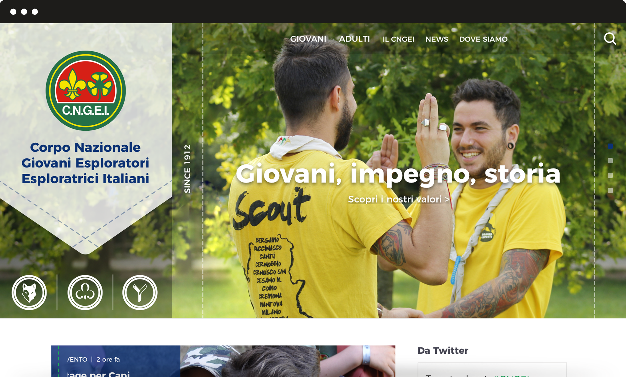
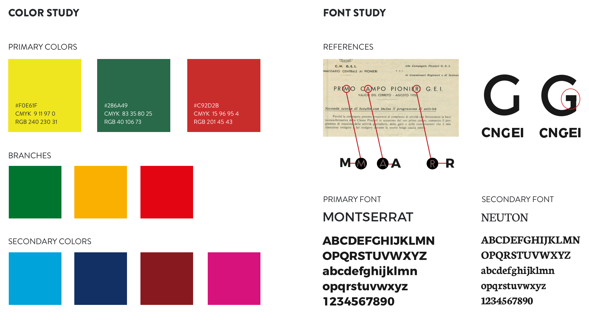
CNGEI is an association structured in branches and sectors that need their own logo. We developed a colour palette and designed brand new logos for each section and branch. The circular shape ensures homogeneity and consistency with the main CNGEI logo provided by the Association.
The result is immediate, simple, readable, recognizable and extremely flexible.
Visual identity
A suitable visual for all levels and structures.
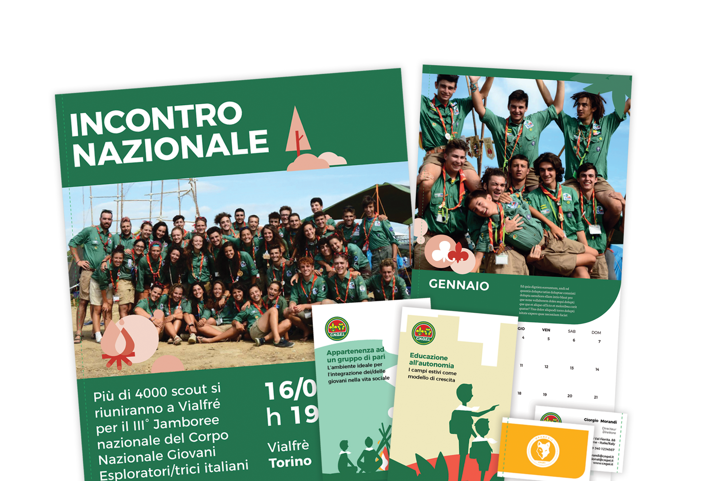
Our main challenge was to provide a precise and consistent visual approach, suitable for all levels and structures within the organization. We also designed patterns to renovate the main templates for both online and offline communication.
Information architecture
A website that simplifies and optimize the navigation flow.
We completely redesigned the information architecture of CNGEI website to simplify and optimize the navigation flow. The header serves as a launcher to access the three mini-sites related to specific sections, in order to meet the interests and needs of different kinds of users.
