Greenpeace –
Make smthng week
We designed a light, fresh brand identity and an highly engaging website to promote a global movement of makers and a week of fun events all around the world.

Inclusive design
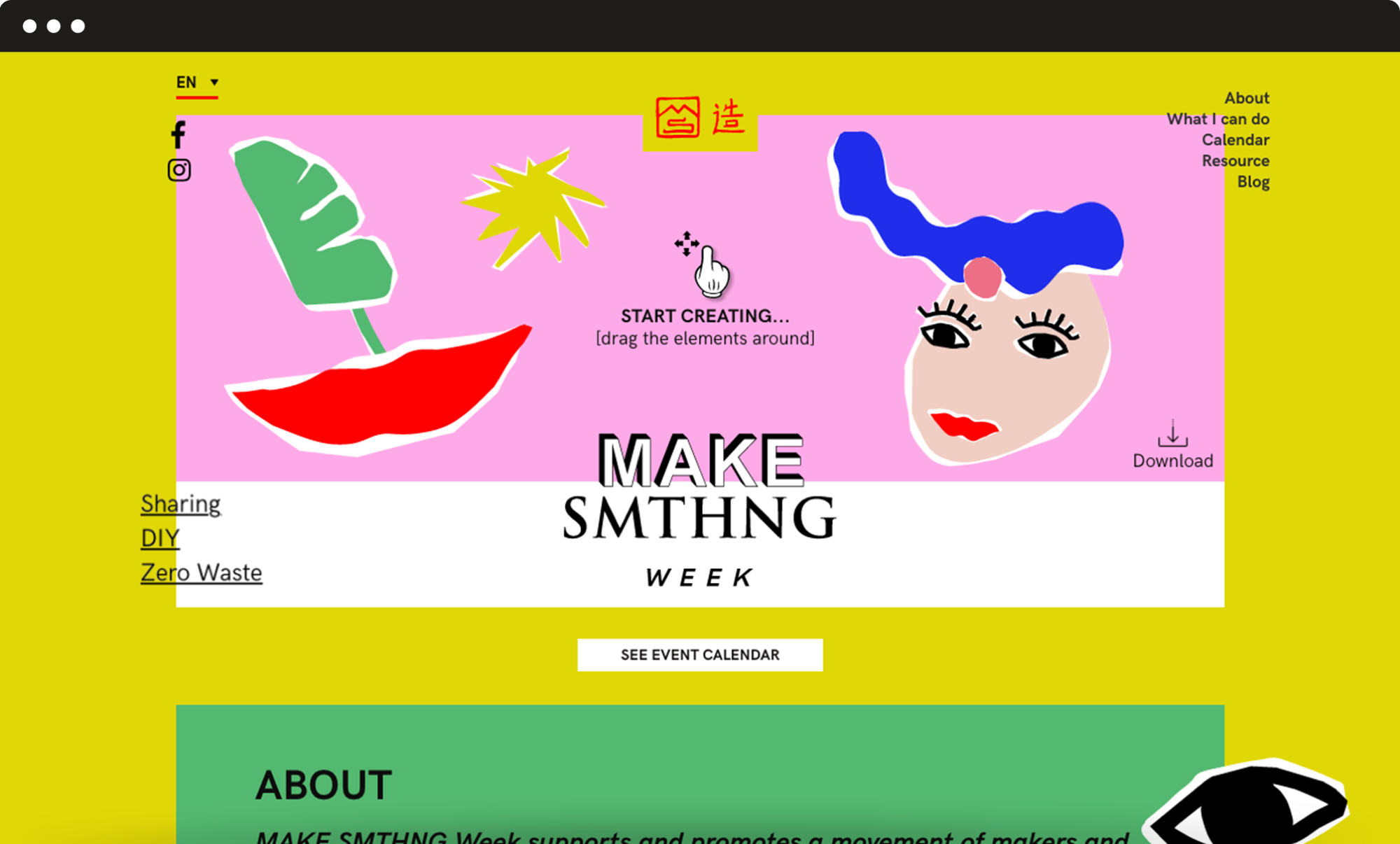
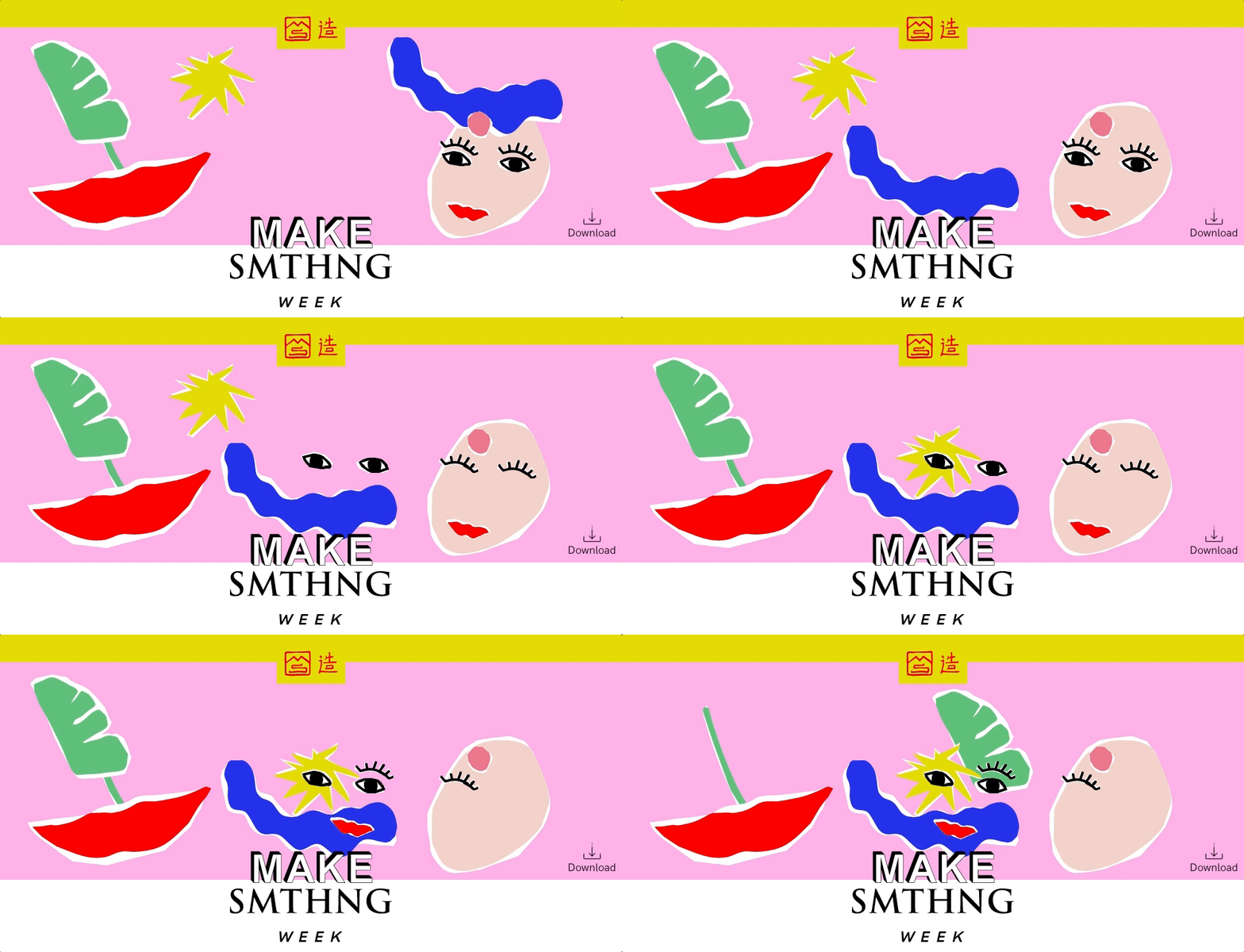
Give shape to your very own cover picture.
We decided to build a simple and engaging top section where users can drag and drop graphic elements, giving shape to their very own “cover picture”. This tool is very much consistent with the principles of creativity, upcycling and DIY that are at the campaign’s core. It also helped to grab the users’ attention so that they would stay on the website and get interested in offline events.

Information architecture
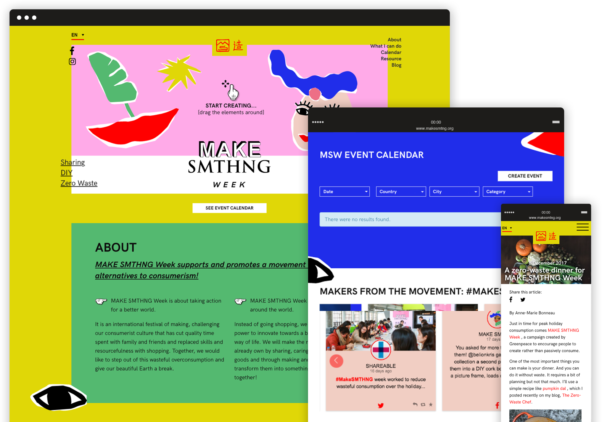
A series of flexible but consistent modules.
The page had to feature a great variety of contents. We played with the colour palette and graphic elements and designed a series of flexible but consistent modules to make the page navigation smooth and give each piece of content the right importance. We also added a fixed menu with anchor links to the different sections, so that users can easily reach any module with just a click.
