Greenpeace East Asia —
Sharing stories and raising funds for the environment.
A new official website for three different countries (Hong Kong, Taiwan, and South Korea), with one strong concept in common: content is king, and it can become a powerful tool to engage people in the fight to protect our planet.
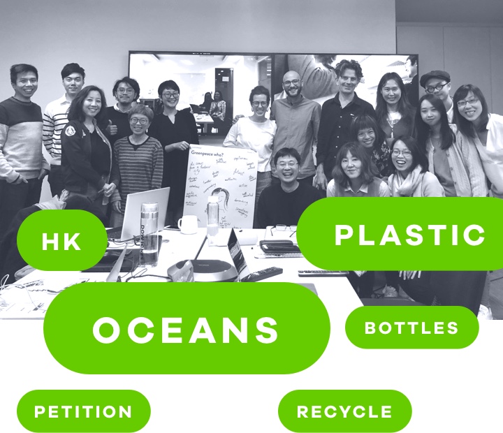
User research
A collaborative design sprint.
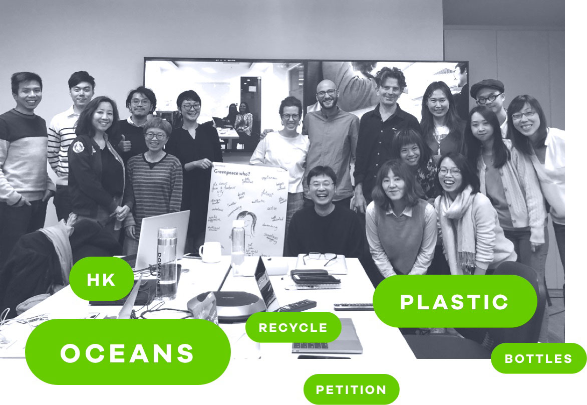
We ran a 2-week workshop with the Greenpeace team where we worked together to define objectives, priorities, and key features of the new platform, using qualitative information, data, and extensive market research. A strong discovery phase is crucial in complex projects, it allows to anticipate issues and find better, more effective solutions.
UX/UI Design
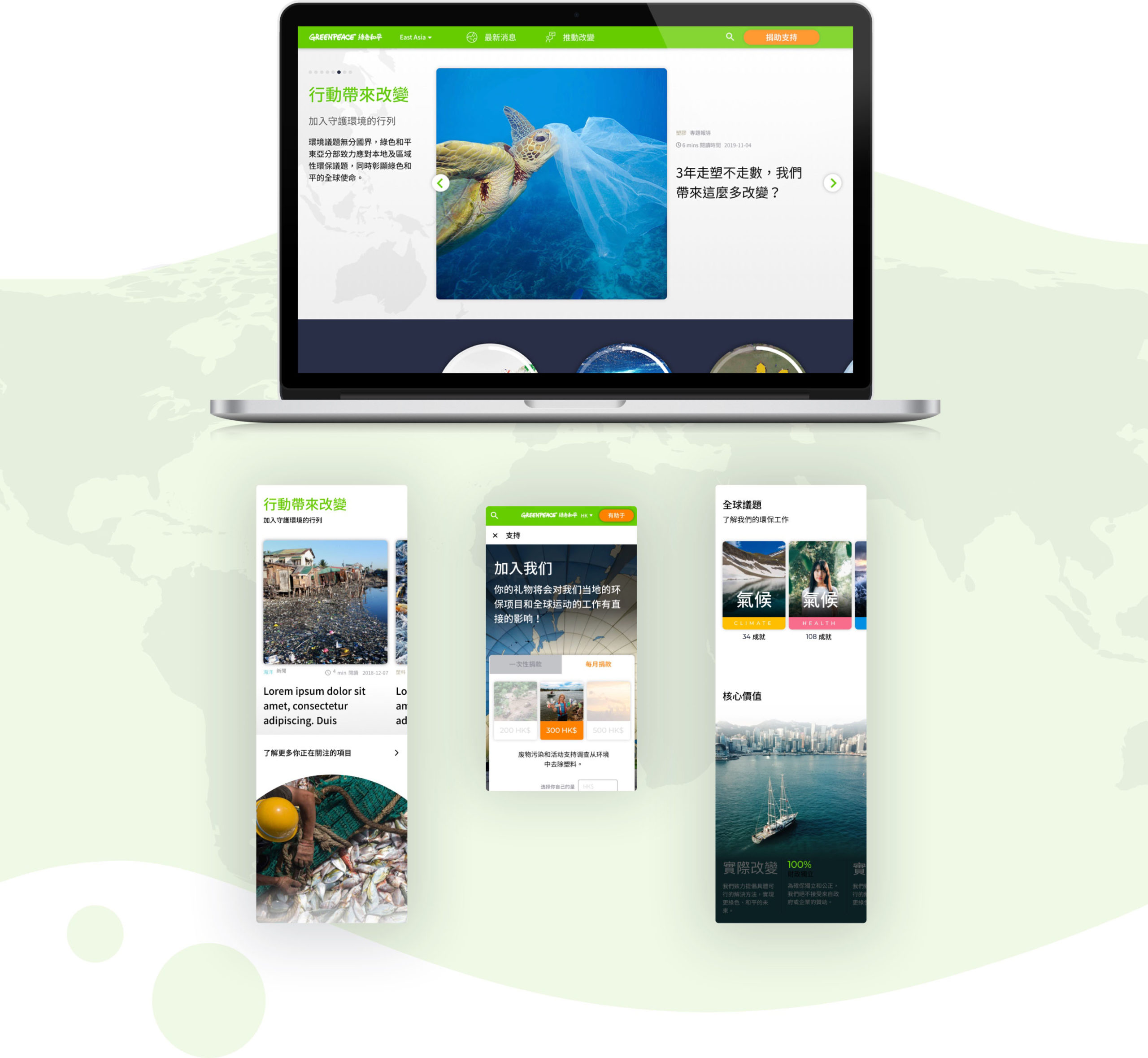
A modular system to encourage cross-pages navigation.
We created a complex yet efficient design system based on dynamic modules to display different contents, either pushed by the administrators or pulled from the users’ topics of interest. The website overall architecture is simple in order to strengthen the links and navigation between pages and drive traffic to the main calls to action.

Web development
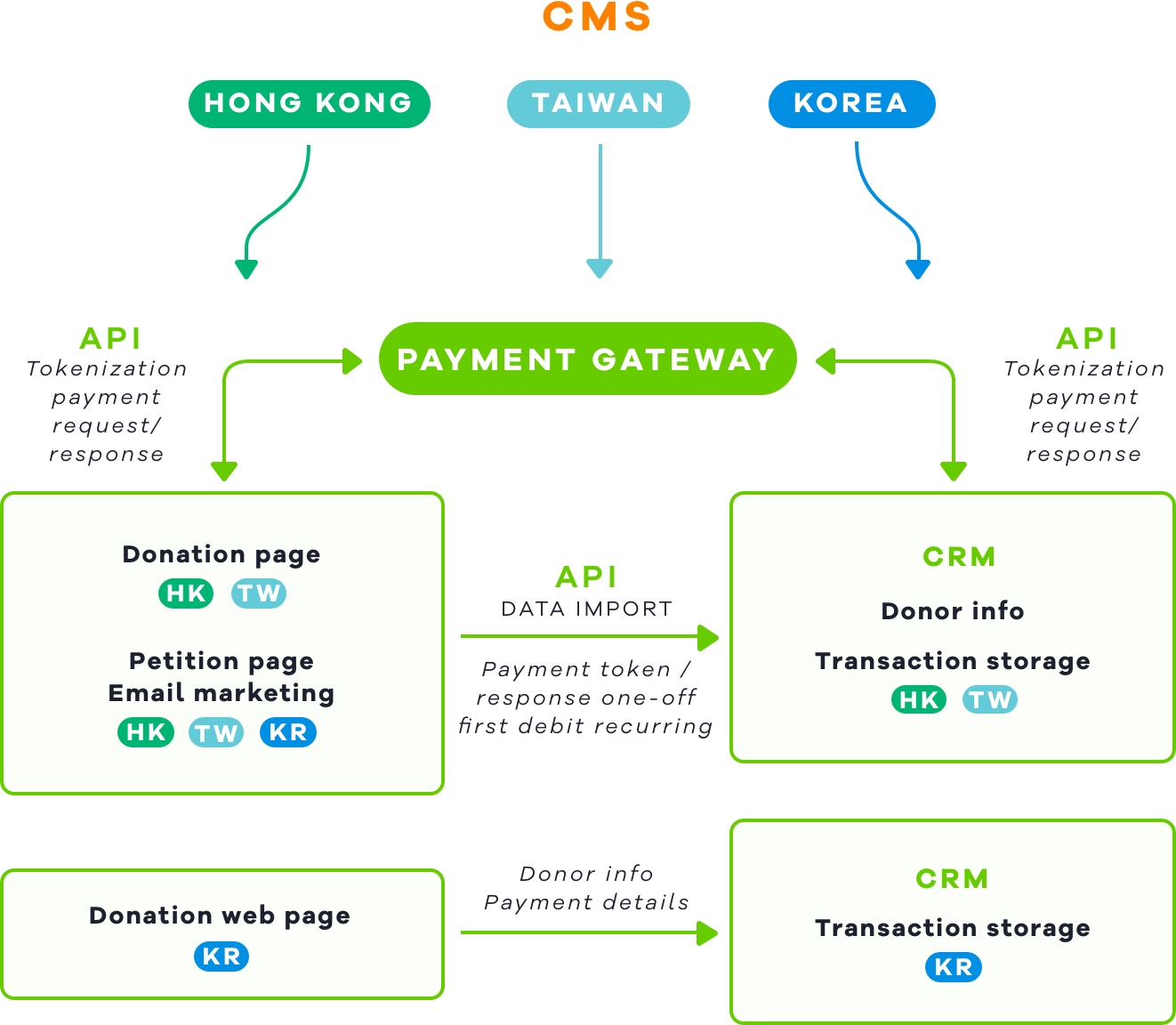
A smart mix of static and dynamic elements.The website is built using WordPress as CMS. Editors and admins can easily manage the pages by selecting the contents to display in each module thanks to the tags and categories that compose the overall taxonomy. We have implemented several integrations with the CRM and payment systems, while also making sure that everything is highly responsive and optimized for mobile use.
